Saturday, 29 October 2011

Lecture 3: Graffiti and Street Art Lecture

Graffiti comes from the Italian word "Scratched"
The first examples of graffiti actually came from drawings and carvings on cave walls- for example in Lascoux, France 
This time was called the Paleolithic period (17300 years old!)


Caricature of a politician. Kilroy/ Chad- World War Two.
Engraving of Kilroy on the World War Two Memorial in Washington DC 


Paris May 68 'We Are The Power'
Student riots- During this period, a movement began- Book Paris 68. Civil unrest inspiring Cultural/ Creative Material 


1970s New York. Use of spray-can Graffiti.
revolves along the hiphop culture- Announcing a presence and saying 'We will not be ignored.


John Naar. Photographer 1973. He was very good at capturing the culture during this period.

Here it looks as if this young teenager is paying some sort of community service.
SAMO- in other words 'Same old Shit'
1977 Manhattan 
The death of Samo was in 1979


Neo Expressionist painting 


Warhol and BASQUIAT- General electric with waiter 1984 


Keith Haring. Radiation Baby 1990


In 1981 he sketched his first chalk drawings on black paper and painted on plastic, metal and random objects that he had found.
POP SHOP which closed in 2005. here he sold t shirts toys and posters. Became a celebrity hangout during his life.


John Fekner- Broken Promises 1980


The Video Game cutlure. 1984 Berlin Wall. The playstation. Communicating on the lack of availability of brands and Technology.


Invadar- French artist born in 1960- First mosaic in mid 1990s Paris- Mosaic tile  which has permanency as its waterproof.
Re-emergence of street art. Banksy Kate Moss 
Shepard Fairey 2008 OBAMA 


Parisian photographer "JR". Taken in the Favelas in Rio 2008


Blu (Italy) and Os Gemeos Lisbon 2010


123 Klan/ Website 
Slussy realeased a special artist series collection to clebreate their aniversary 
PAUL CURTIS (Moose Reverse Grafitti) 


VHILS aka Alexandre Farto (Portugal) London
2008


Faith 7. Amsterdam- Red stickers around the degrees of plaster 
Diva (Brooklyn) FEMAL GRAFFITI ARTIST 


Art of resistance JR making light of a situation human representations of a people on a wall outside 
Style Wars 1983 an early documentary on hip hop culture- made in new york city. 


Monday, 24 October 2011

Revolution Design In Russia- Richard Miles

Russian October revolution 1917 - Revolution street workers The Bolshevik


Leader - Lenin, Workers take the country OCTOBER (The ten days that shook the world)
1927 Director : Sergei Eidenstein

1917 - 1921 Russian Civil War- A film was made on a Left radical persepective- PROPAGANDA!
Post Revolution Society.

B Kustodiev "The Bolshevik' 1920 Painting

The flag in this painting represents the blood of the workers who died to free Russia. it also is a symbol of the Revolutions Left Movement "BOLSHEVISM"

1917 mid 1920s Intense artist experimentation new society, new rules and new order
the plan was to invent a new style of art to suit the new russia. Russia was at the time a third world country and workers controlled the new country.

TRUTH AND MATERIALS
FOR FOLLOWS FUNCTION


Lenin encouraged modernist art- They had a deep interest in Picasso's work 'Factory'. This was the time when art work would have workers in it instead of Kings and Queens. A new Modern society was being born.
MALEVICH and Suprematism-  "...was an art movement focused on fundamental geometric forms (in particular the square and circle) which formed in Russia in 1915-1916. It was not until later that suprematism received conventional museum preparations. It was founded by Kasimir Malevich..."
WIKIPEDIA- Suprematism


Late 1920s onward Socialist Russia : sOCIALIST rEALISM radical Period
10 years after Revolution El Lissitzky " Beat the Whites with the Red Wedge"


Symbolizing the revolution. Image designed to communicate through image not text
WHITE symbolizes ZC/ P forces.
Radical experimentation with art and design.


Poster by Rodchenko "Books" 


A lot of people where illiterate in Russia, when i say a lot I mean pretty much the whole population. Not only did this poster spread a message through image but it also encouraged the mass to learn how to read. Woman in the Poster. Makes more woman interested, rules out the conventional man and wife role. Again rd is used in this poster and THE Triangle which symbolizes the Russian army formation. Education was a new way of getting rid of the old regime. 
WOMAN- is photography! Modern! Looking forward into photography . Photography represents the world in a 'truer' way.


Art Designers- The Constructivists- CONSTRUCTING THE NEW WORLD.


Tatlin's model made to be bigger and better than the Eiffel Tower


This was never made as it cost way too much!
The Constructavists aim - Achieving the communistic expression of material structures .


STEPANOVA AND POPOVA QUOTE 


"it is time ti move from designing clothing ti designing stucture of fabric. This will allow the textile industry to jettison its present excessive variety, and help it standardize and improve, at long last, the quality of its production"


Aranovich D 1929


1925 Paris expositions USSR pavilion by Melnikov
Countries building ti show the world their culture.
Melnikov designed this to show off to the world.


VKnUTEMAS- progressive art school. Prospectus cover by El Lissilzky.
STEPANOVA- Constructavist 


Buliding Moscow Metro- we shall compete the plan of great work.


Wednesday, 19 October 2011

Context (Three Posters) "Honesty is the best Policy"

Pyramid


I found this and its reference for my text poster. I was trying to explain how things being high up, and in this case on top of some sort of pyramid, to have an importance. In this poster you can see stairs like most conventional Egyptian pyramids have. When you think of someone of importance you think of  them to be 'High up' or in most stereotypical circumstances, the boss of a company being at the very top of a building. I hope this sort of explains my point!
behance.net/Gallery/PYRAMID-EXPERIMENTS follow this to find to look at other examples of this poster.

Heart Idea


"Here's a quick medical heart illustration sketch I was working on. There's an ekg reading flowing through and around the heart. The sketch is incomplete, but in essence, that's what a sketch is I guess- incomplete. It's more of a study really"- FERNANDO MEDINA
Fernando Madina is an illustrator/ graphic designer that I found on http://www.fernandocreative.com/ which is an awarding winning website dedicated to graphic design.
The reason why I want to to involve a hard is because there is also a saying "Honesty comes from the heart". For my IMAGE AND TYPE I want to draw a heart.

Unfortunately, I lost the website for this image as I found it awhile ago but this just so happens to be the foundation of my heart illustration on my IMAGE POSTER and my TEXT & IMAGE POSTER
I never wanted to illustrate a real heart for two reasons. 1) It would take a really long time (NEVER REALLY AN ISSUE) and 2)- It would end up most probably looking much to realistic for my posters. That could have worked but at the end of the day I just wanted to create something simple and this piece of reference above is just perfect! The text in the middle doesn't mean anything to me and the 'Change' in the bottom righthand corner. The colours also but the red ended up suiting my posters quite a lot. To look at my poster on my DESIGN PRACTISE click HERE.


From this I got the idea to use the baby blue because it has nice conventions and connections to heaven and god. Quite quickly I decided to go with the red as i thought it linked more with the body and the heart. The deisgn is by Frank Chimero : Illustration & Design. I also like what the design is saying. 
To be honest to you audience and yourself. I feel like this has a strong connection with what I want to say 
on my posters.


A TRIPTYCH

"A triptych  is a work of art (usually a panel painting) which is divided into three sections, or three carved panels which are hinged together and can be folded shut or displayed open. It is therefore a type of polyptych, the term for all multi-panel works. The middle panel is typically the largest and it is flanked by two smaller related works, although there are triptychs of equal-sized panels..." -Wiki/Triptych

When finished our posters will in fact form to become a triptych.

I straight away thought of Francis Bacon's work (1973) and this particular Triptych. I looked into what the painting is about. The male figure in the poster is thought to be his lover John Edwards. In the first panel the figure is struggling on the toilet, bent over in pain. The central panel shows the figure in a more comfortable pose, almost as if he is resting his head on his hand on the toilet, passed off from the amount of alcohol he has consumed? The darkness spilling from the bathroom is only quite scary and dark. It has the feeling of depression and evil. In the third panel it shows the figures throwing up in the sink. 

"My painting is a representation of life, my own life above all, which has been very difficult. So perhaps my painting is very violent, but this is natural to me..." Francis Bacon

Again I chose this because its a very honest painting by Francis. He admits to a difficult life an its a very revealing painting to who he is a a person. The paintings are a sort of story too. Like my posters. One by its self doesn't make too much sense but the three together give a much more vivid and greater understanding. 


These posters where designed by Grupo Habermas. Whats really hard for me is his whole website is in spanish so I can't read it or find out who he is. I found is work on lovely stationery which is  '...curating the very best of stationery design...'.
I liked these because of the formation of the type. Considering that my posters follow a very similar format I feel obliged to go along with something very similar to this!

Wednesday, 12 October 2011

Lecture 2: What is Postmodernism?

Does Postmodernism exist? Whis is it? Look again at what Modernism is. Form Follows Function.
-La Corbusier- Villa, 1928-9.

La Corbusier


Associated with
-Innovation
-Experimentation
-individualism
-progress
-Purity 
-originality
-Seriousness
The Postmodern condition-
-Exhaustion
-Pluralism 
-Pessimism 
-Disillusionment....with the idea of absolute Knowledge.


Jean Tinguely. 'Homage to New York' 1960- Musuem of modern art


Homage To New York
Origins of Postmodernism
1917 German writer Rudolf Panniwitz


1960- Beginnings
70s  -  Established as term (Jencks)
80s  -  Recognizable Style
90s -  Dominant theoretical discourse. TIRED AND SIMMERING.


Postmodernism- After Modernism. The historical era following the moderrn- CONTRAMODERNISM-  'Late Capitalism' (Jamison). Artistic and stylistic. Global Village. 
The Language of Postmodernism Architecture (1977) 


CHARLES JENCKS declared that on the 5th July 1972 at approximately 3:32pm that MODERNISM HAD DIED.


UTOPIA and TECHNOLOGICAL DETERMINISM. Better technology.
Postmodernism was a 'Reaction to the Rules. ROBERT VENTURI learning from Las Vegas
1972- Mies Van Der Rohe and Philip Johnson. New York 1957.

Park Hill Flats SHEFFIELD 


1960- Proposed regeneration Urban Splash
Frank Gehry Museum Bilbeo 1966
James Stirling- Stuttgarb Germany. 1977- 1983


Modernism movement (Dominant post war) Postmodernism Aesthetics- Roy Lichtenstein. 'This Must be the Place'
JF LYOTARD the postmodern condition 1970- Totalising Belief System.
Ouintan Terry (1992-3) The Robinson Library


Postmodernism Dyslopia- Akira Anime.

Robert Venturi "Complexity and Contradiction in Modern Architecture" 1962 (Published in 1966)

"i like elements which are hybrid rather than 'pure', compromising rather than 'clean', distorted rather than 'straight forward', ambiguous rather than 'articulated', preserve as well as impersonal..."


QUOTE 2


'Generaaly postmodern artists like to mix the highbrow and the populist, the alienation and the accessible, and to 'sample' elements from diffrent styles and eras"


David SHRIGLEY- ART LOVERS 2000


Roy Lichtenstein RED PAINTING


high art/ low art DIVIDE beggining to CRUMBLE. LV POSTMODERNISM CITY? Robert Venturu

Conclusion

A vague term Postmodern attitude of questioning conventions. AESTHETIC- multiple of style- RICHARD HAMILTON. Shift in through and theory invest. 

Friday, 7 October 2011

London Vandal

London Vandal has given me some more ideas. I'm going to with a more 'Tag' like look in my letters like theses ones and then have the Slime related to Grime. London Vandal is a website full of graffiti. I believe this will be great for my final idea.

Other Foundation Fonts.


I have been Playing around this one in my sketch book and the examples are now on my Design Practise.

Slime Typefaces: BJ Heinley


Here is an artist who really likes slimy typefaces. His names is BJ Heinley and he is a Senior creative director and entrepreneur out of Austin, Texas. He is only 20 years of age! Look at these examples below too. It makes me think that maybe I am going to put more slime on my letters


I really like this example. It reminds me of some sort of horror movie from the 80s. I love the use of colour too.


To Visit BJ's blog follow this link here- behance.net/heinley
BJ's work is really inspiring and I like it how he works in the same style all the time. The typefaces he uses is not what I'm looking for but the grime defiantly is. When I look at his work it looks very almost retro horror. The sort of font you would expect to see on an early horror movie. It also reminds me of the goosebumps logo-

There are elements of this logo that I like however I won't go onto use any of them. I'm quite fixed on creating a very conventional graffiti font.

Thursday, 6 October 2011

Lecture 1: Modernity and Modernism

5th October 


During this lecture were shown how Modernity and Modernism during the birth of city radically changed the Art world. Industrialisation and Urbanisation is the CITY. 
Modern artist started to look in a different direction, they started looking at the city for ideas instead of painting myth and religion.
Paris was the most modern city of this time. They loved to show off to the world showing all this modern stuff like the Electric Walkway and of course later on the Eiffel tower.
Modernity started in 1750 and is said to have ended in the 60s, this is inaccurate and it is said you can argue against this.
Urbanisation means to come from a county life and join the city. In the city their was lots of new technology being invented.
Great Exhibition 1851
Paris Exposition 1855
Process of rationality and reason SECULARISATION. Scientific reason takes over. 
The eiffel Tower also connects the the power france had with Modernity
rail stations ment that the world had to agree with a 'world time'
HASSMANISATION PARIS 1850 onwards was considered a 'new Paris'
Haussman was an architect and his work ended up pushing poor people out of the cities.
Radically changed by inventing huge boulevards that took out the tiny boulevards which reduced crime by a big number, street lighting was also introduced. Artist ended up turning to the cities as modernism was a huge part of thew worlds life.
1893- Massive change in the world technology meant a huge change in the worlds art.
FASHION-  This was a way of communicating to the mass in the cities of your wealth/ who you stood for. (It was different to the country when people there they knew who you where.) 

Example of Boulevards and fashion in the city (Paris)
Caillebotte's Paris Street; Impressionist Exhibition of 1877. "It shared the spotlight with Pierre-Auguste Renoir's Ball at the Moulin de la Galette. Its massive size, almost 7 feet by 10 feet, drew a great deal of attention and dominated the 1877 exhibition which was largely organized by Caillebotte himself"- goodreads-art trivia of the day august november


Modernism emerges out of the subject, artist/ designers response to 'MODERNITY'.

BAUHAUS ART SCHOOL which was closed down when the nazi's came in to power. Their logo was simple and could be understood by other countries. 

INTERNATIONALISM- a language of design that could be understood by any country (Furniture etc)
HERBERT bayer stanley MORRISON- Times new roman 
Conclusion-
The term modernism is not a natural term it suggests novelty an improvement "modernity" (1750s- 1960s)  Social and cultural experience. Modernism- The range of ideas and styles 


Tuesday, 4 October 2011

Critical Studies Image Analysis Exercise

In this essay I will be exploring to these two images and discussing:

-The choice and organisation of font and style of illustration
-The purpose and meaning of the image
-The target / potential audience of the image
-The social and historical contents relevant to the production of the image

Savile Lumley (1915) 

The Uncle Sam Range (1876)


For their time, these pieces are very conventional as they are soaked in patriotism and both heavily to do with Propaganda. The style of these illustrations are normal for that day and age too. It’s what people of that era would expect to see in such posters.

The 'Uncle Sam’ Range poster is packed full of information. The poster is advertising a cooker. The type used links to the saloon, west, cowboy look which connects gold and freedom and because of this the type connotes power and wealth. In Savile's poster, the italic font used makes you know its being said. It’s very powerful even though its coming from the little girl. The "YOU" relates with the famous Uncle Sam poster where it says 'I want YOU'. It’s a power piece of propaganda as it doesn't seem to relate to the mass, but to an individual in the audience. The meaning of the image it to make men who weren't in the war while it was happening feel ashamed. Its 'post' war as this was made in 1915, only one year in to the world war. The daughter is reading a book; which I can only see as a book of the great war where Briton seized victory of the Hun. A book glorifying the success of victory, and she’s asking 'where were you?'. The father figure is looking into the audience’s eyes in a way which states he wasn’t, and that his children would be ashamed with him for not supporting his country.

In the Uncle Sam Range poster, there are essences of racism. For example, the World sitting opposite Uncle Sam is filling out a list of foods that other countries might eat. England is second down with ‘Roast Beef” but towards the bottom there’s China with food such as ‘Birds Nest’, this would be offensive. Here the advertisement is implying that America is a better country. Then you can see the small black boy working by the oven. Finally the worlds face is on Africa, stating that this world working on this list is African? This of course was in a time where racism was a big issue.

I believe the target audience for Lumley’s poster is teenagers and young men. The Uncle Sam poster is aimed at older men. Uncle Sam in the Mans point of view is him, and the woman serving Sam food is his wife, and the kids round the table are the children, a nice stereotypical middle-class home which, if this man buys the cooker, will have.

Another few things I can find in Lumley’s image are about national symbolism. The red rose curtains, the fleur delis on the sofa and then finally, to me the most obvious symbol, the colours of the children’s clothing. They form the colours of the union Jack. Even though one of these posters is propaganda and one is meant to be an advert they have very similar messages in them which at first aren’t obvious to the naked eye.

Washington Maps 1903


 I love the old fashioned look this poster holds. Fact is, it is old as it says '1903' at the bottom. The poster I found on a blog and the only names that were on there were " John Wilkins in The Baroque Cycle, Neal Stephenson". I can't work out what the poster is apart from its some kind of map for Washington DC? It seems much to technical for a letter press, but it could be a screen print; I can't be sure. The layout works well to. Usually when you use to many fonts on one poster you lose style and meaning. I think because this poster is black and white the poster works. I love the type face used on "Sanborn Map Company" too. All in all its a fantastic poster. I would like to explore typography similar to whats been used here.

LOVE Hoban LetterPress


Printed on 110lb Crane Lettra. Firstly I had no idea what "Crane Lettra" was so I looked into it here. This is amazing.  The emboss works well with the red . You sort of get this shadow effect which works well as a black border, separating the white from red. I'm not sure how big this is though, it almost looks like the size of a stamp. Designer  : Kevin Calkins -- hobanpress

LOVE "Linotype: The Film" Official Trailer


This is a fantastic trailer for a documentary about keeping Lynotype alive. I found it on "I love Typography.com". I find it so inspiring how there are people in the world that don't use modern technology.

My Foundation Ideas for my Typeface

 "Philly Sans" Taken from Da font. In the tutorial it mentions to use a thick and bold font. This fits the description.


Arise Logo Font designed by Matteo Marco Milazzo. Before I decide which font to use I am going to consult Jack about what one he would like. I wouldn't consider this to be cheating as I would like the create something that he likes! Da Font

Tutorial on how to create a 'Gooey' Effect

To be able to achieve this look in my final typeface would be amazing. However, I have used photoshop for three years now and I'm not sure how to use the Pen tool. This exercise would be great practise if I decided to run along with this look in my typeface. Above is the final outcome and underneath are a few examples of the work in process. FOLLOW THIS LINK TO FULL TUTORIAL You The Designer.com


I feel this would suit Jack. I'm not too sure how though. That I need to find out. The font underneath will not be the font used in the tutorial, the font used here is Avant Garde in bold. I intend to go along with examples like the ones underneath this post. 

Monday, 3 October 2011

Jack Fower Reference: Some Type Ideas :

I've been searching the internet and have found some examples that sort of match Jack's personalty

Jack mentioned that he is interested in Graffiti and that he also does it. This typeface I found on the "lsh120" blog, which is obviously a blog but has lots of work revolved around graffiti. To me, Jack has quite an Urban look. His image looks like he is interested in graffiti, and of course its fact, he is. So, i've decided that my foundation is going to have a graffiti look to it.


This piece was made by Steven Bonner. I quite like the idea of adding some drips to the letter, like when you do graffiti the paint drips. It also links to his music taste which is Grime. When you think if grime you can sort of relate it to dirt and mess (Not talking about the music). The drips of this make me think of mess. Like paint thats been spilt.

Said Swayssi- http://www.behance.net/SaidSwayssi


Andre Beato! (Again)

When looking for other ideas that might inspire me in a particular direction I found this piece a blog that happened to have Andre's work on it. 


To me this has element of graffiti in it so I decided to blog it. It has that stereotypical drip effect that you happen to find quite a lot in street art. I like the curls too, it gives the effect of the letters to be like water or waves. I love the simplicity or this peice. The grey lines add so much to it. They make the type seem so much more 3D and the white works so well against the black. I indent to involve this type of look in my letterforms.

The Fundamentals of Typography by Gavin Ambrose & Paul Harris


Introduction to Book- "Language is the dress of thought' -Samual Johnson.

This book is packed full of pretty much everything to do with typography, beginning with the history of type; it takes you on a journey through Hieroglyphs, the Greek Alphabet, the Roman Alphabet, 50s-90s Type, Frutiger's grid, colour, Scale and so much more. These two pages I decided to photograph as contextual are about Graphic Design since 2000. It talks about how high resolution digital printing has increased the options and challenges in graphic design.
The Logotypes, parent 2005 type design ( FASHION) I used because of its overall look. It has many conventions to to with graffiti. For example the bubble writing and the wet dripping paint.
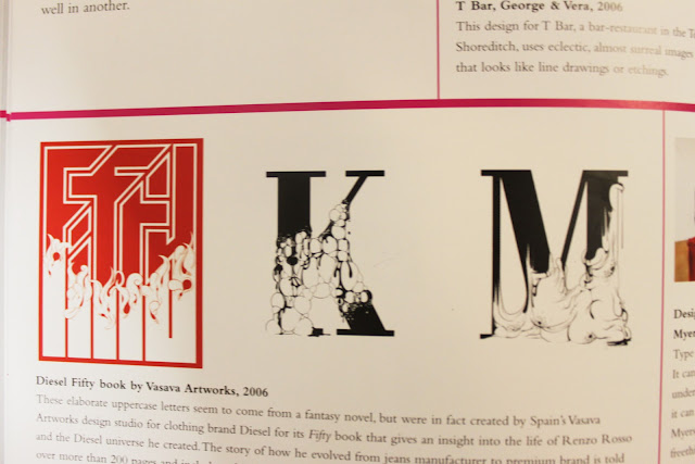
I then photographed the Diesel Fifty book by Vasava Artworks. I am deeply interested in these letter forms (Picture above). Espacially the K & M. It looks like there is something rapidly growing on the letters. 
'Type can be many things. It can be quite, load, brash, understated, but ultimately, it can be unexpected. Myerscough, with their freethinking approach to the possibilities of typography, demonstrate the ironic beauty and power of a simple message...