Jack mentioned that he is interested in Graffiti and that he also does it. This typeface I found on the "lsh120" blog, which is obviously a blog but has lots of work revolved around graffiti. To me, Jack has quite an Urban look. His image looks like he is interested in graffiti, and of course its fact, he is. So, i've decided that my foundation is going to have a graffiti look to it.
This piece was made by Steven Bonner. I quite like the idea of adding some drips to the letter, like when you do graffiti the paint drips. It also links to his music taste which is Grime. When you think if grime you can sort of relate it to dirt and mess (Not talking about the music). The drips of this make me think of mess. Like paint thats been spilt.
Said Swayssi- http://www.behance.net/SaidSwayssi
Andre Beato! (Again)
When looking for other ideas that might inspire me in a particular direction I found this piece a blog that happened to have Andre's work on it.
To me this has element of graffiti in it so I decided to blog it. It has that stereotypical drip effect that you happen to find quite a lot in street art. I like the curls too, it gives the effect of the letters to be like water or waves. I love the simplicity or this peice. The grey lines add so much to it. They make the type seem so much more 3D and the white works so well against the black. I indent to involve this type of look in my letterforms.
The Fundamentals of Typography by Gavin Ambrose & Paul Harris
Introduction to Book- "Language is the dress of thought' -Samual Johnson.
This book is packed full of pretty much everything to do with typography, beginning with the history of type; it takes you on a journey through Hieroglyphs, the Greek Alphabet, the Roman Alphabet, 50s-90s Type, Frutiger's grid, colour, Scale and so much more. These two pages I decided to photograph as contextual are about Graphic Design since 2000. It talks about how high resolution digital printing has increased the options and challenges in graphic design.
The Logotypes, parent 2005 type design ( FASHION) I used because of its overall look. It has many conventions to to with graffiti. For example the bubble writing and the wet dripping paint.
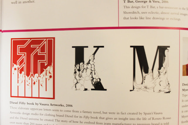
I then photographed the Diesel Fifty book by Vasava Artworks. I am deeply interested in these letter forms (Picture above). Espacially the K & M. It looks like there is something rapidly growing on the letters.
'Type can be many things. It can be quite, load, brash, understated, but ultimately, it can be unexpected. Myerscough, with their freethinking approach to the possibilities of typography, demonstrate the ironic beauty and power of a simple message...'


