Visible Signs - David Crow
Books
Books
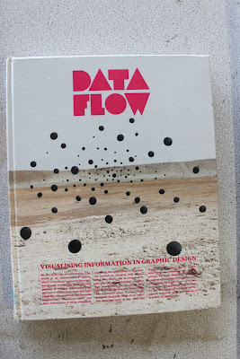
There are as you can see 9 stages to his book. I am not going to be able to go into all these areas so I am going to pick a few and go into them. ‘The
book
Explores the mechanics of visual language in an attempt to help to understand
how visual communication works’
Date Flow
This part of the book looks at how different parts of the world look at everyday things like, for example, dogs. obviously, visually dogs look the same where ever you go in the world. But the name is different. That where signs come into action. Take every day signage into this. Think of airports, signs are designed to communicate a simple message to the viewer no matter where they are from in the world. Look at the example below this: Encoding/Decoding Model. They are simple, legible signs.
Encoding/Decoding Model:
I want my paper to fill filled with signs like this and their meaning. I am pretty rubbish with the pen tool so this is going to be really good practise for me. I want my publication to have famous quotes about semiotics too but I'm not sure if I will be aloud to do that! I will have to check with the tutors to see if it will be ok. Below is
"...Stuart Hall developed the encoding/decoding model. “The basic premise of Hall’s encoding/decoding model of communication is that the media apparatus has an interest in production, circulation, distribution/consumption, and reproduction rather than conveying a message.” Hall’s encoding/decoding model focuses on the ideological dimensions of message production and reception in a capitalist world..."
For my front cover I might just have an arrow with a black background. An arrow is as simple as signs go. We can tell from right, left, straight on or backwards. Its simple signage. The example above this I managed to find on google images. I have to say some of these signs I don't understand. The 'E' and the 'B' aren't legible, and the 'A' 'C' 'D'. I like the elevator example here. Its simple some lines cleverly peiced together to create meaning. Thats what I like about transport signs
These books will be the heart of my research as they contain all the information I need to know. Visable Signs by David Crow breaks down semiotics and gives very interesting examples and diagrams. In my publication I intend to quote from David as his definitions make semiotics easy to understand. I fear that the publication will turn in to another david crow book but I'm sure it won't. I intend to word it myself, but I feel I should quote from david.
West of England Design Forum.
I found this and it gave me the idea to think about colour in my publication. Traditionally, newspapers are quite dull and boring but I like the idea of making the colour visually pleasing. Almost make an unconventional paper. I say unconventional because the paper would be going against these traditional rules of dullness! Out of the examples above I like the yellow one, navy one and white with pick one. My orinal idea was to just have a black and white paper but I am strongly against that now as I feel having colour will bring the newspaper out and attract a wider audience so to speak. Its not every day you see a colourful newspaper. There was no designer name or even a description to what these are but they look like postcards that promote the 'West of England Design Forum'.


Loud and Quite magazine
Publication
I did consider making posters for my idea but thought making a newspaper would be a new experience and would in the end look as a better a final design. Loud and Quite is a free newspaper from leeds looking into the music scene and its good research. I think the main thing about newspapers are they are very cheap to print and put together correctly can look fanastic. This sort of magazine is completely different to a normal conventional newspaper like 'The Times' for example. This publication has been put together to look fresh and simple. Newspapers like 'The Times' have to fit a lot of information into them which often leaves them messy and unlegible. Newspapers like 'Loud and Quite' have a target audience of young people- Possible THE main reason why it has this particular layout. In Media during sixth form I learned that stereotypically teenages have a much shorter attention span that adults or teenagers from past generation and from this magazines have become simple with a large image and little text. This is just a theory but it might be true!
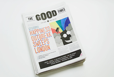
The Good Times
'The Good Times is a Church of London's response to the January blues and the result of a week long project to write, design and print a one off newspaper which celebrates only good news. In the seven days leading up to todays publications date ( which according to the dubious claim of an ad campaign from a few years ago, is the 'most depressing days of the year*) TCoL rallied writers, designers and illustrators together to produce a newspaper which exclusively features 'good news' stories...'
website : creativereview/the-good-times-newspaper
...............................................................................................................
Presentation Boards

Presentation boards for first crit
...............................................................................................................


