Mango Tree
I already knew what the look of my website would entail but I still wanted to get some inspiration from blogs and general websites that had many examples of web design and layout. The first example above is an example from the Mango Tree's homepage. I really like the illustrations but when it comes to my website I want there to be depth, similar to my promotional posters. I don't want my website to have any white space of white colour in general.
Duke Studios
The famous Duke Studios, this was probably the first website I went on and though wow, this is amazing. I love how colourful and visually entertaining their web is. The best part of the page for me is the spinning cards, movement like that is, in my opinion, so important when it comes to a website because it really makes it stand out. Like Simon said, you can tell whether you want to stay a webpage within the first 5 secounds. Looks are very important. Always judge a book by its cover when it comes to design.
PL
I decided to talk about this purely because of the layout. I am most interested in the pattern for the tabs, a conventional rectangle, or in some case square, that contains the tabs and links to navigate yourself around the website. Visually it is nice too, I like how there is so much image but there is a fine line between each one, causing the website to have a sense of being busy but not clustered.
The Great East Village Baked Goods
Again, I chose this because of the illustrations and the nice de saturated colours. Looking at the website closely, the main thing I like about it a very simple one. If you take the main header, look underneath it were the main tabs for the website are. That banner very subtly makes the website have depth and makes it feel 3-d. Almost like its coming out at you. It's this sense of depth I want to contribute to the website.
Andy Baron - www.andy-baron.com/
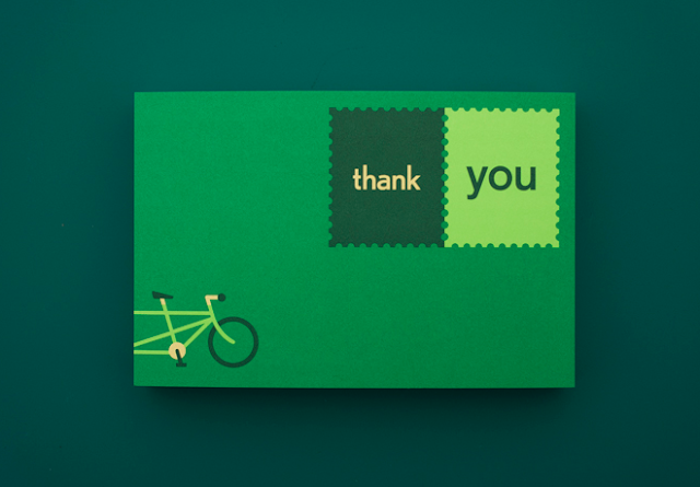
Heres a last example I thought I should add, I managed to stumble across Andy Baron through designspiration and I was very impressed by his work and how well executed it is when it comes to the final products and final photography. I am very much into the colours he uses as well. Take the last example I have here, I love how the green is a sort of de-satureated green, it gives the overall design such a light feel. I know its only the background but I love the turquoise blue. Now to why I really chose this to mention. I love the website he designed, its the very first example as you might have already guessed. From colour, illustration and layout I think it works wonderfully.


No comments:
Post a Comment