
Bethany Maddock

These tags were designed by Bethany Maddock (Follow link to Blog) and are good reference. Imagine this is what are final outcome looked like but you opened it up to find ways of treating your shirt once purchased.
"I am an alumni of Maryland Institute College of Art (MICA) with a BFA in Graphic Design, and I also am a member of the AIGA, Boston chapter. During the summer of 2009, I was an intern for PUMA, at their international office in Boston, MA. check out my website at www.bethanymaddock.com..."
Pete Stanley

This tag was designed by Pete Stanley an I found it on theplasticashtray which after investigating is actually his own website! I like the card used and the graininess of the type and image. The tag is too small for what I believe we are looking for but in terms or look I think its a road we could possibly go down! Pete Stanley is an experienced Graphic Designer who specializes in advertising and promotion but is a keen illustrator and musician. THE PLASTIC ASHTRAY on the other hand was once an independent online music magazine which was run by Pete himself. The website is now also his magazine and porfolio.
Anna & Marina Logo & ID Fashion Brand


"...The brandof Anna & Marina was designed as an alternative solution for admirers ofinternationally acclaimed brands such as Prada, Gucci, MaxMara, Giorgio Armani, Lanvin, Nina Ricci, etc. The designers were challenged to make the logo andidentity an expression of the visual image that would communicate without toomany words the core message of the brand and identify its target audience..." http://www.behance.net/gallery/Anna-_-Marina/816178
HeyDays


Berg & Berg is said to produce classic timeless producs. I decided to blog this because as you can see above in the suit case is a label/ tag with the bold writing 'Dear Customer' written half way down. This Label/ tag is obviously there to inform or educate the customer on their recent purchase. The top image is a variety of stuff including labels, booklets, leaflets, stamps etc and I am interested in the colour and general look they have. In the top left courner you can see two tags and you can just see the third in third. These look as if they have been presses and embossed and this is something I would love to get into in the future. It could even be something the group ends up doing in the next two weeks who knows.
'...from the start, Berg & Berg has created classic timeless products, made by the best manufacturers and using only the finest materials. With a discerning eye for quality and lots of inspiration, they offer you the items that will be the future classics in your wardrobe. We brought the deserved authenticity and craftsmanship to their identity, while stamps, personal delivery notes and signatures adds a feeling of personal service....' - http://heydays.no/2011/bergberg/
(about)HEYDAYS

'Heydays is an Oslo-based design studio that creates strong visual concepts that trigger curiosity, create excitement and show ambition. We listen, research and challenge. We remove noise to add value...' http://heydays.no/profile/
HeyDays was founded in 2008 who work across a variety of media and fields, ranging from identity design to art directing photographies. They offer both design and design consultancy, and may be hired for complete deliveries or as part of a external team!
Bekväm Clothing
 |
| http://www.coolhunting.com/style/bekvam-clothing.php |
This example is very similar to the Pete Stanley tag I found, it holds very similar characterises such as the card it has been printed on and the same grainy faded black text & image. I want the group to go towards a small booklet instead of a tag. I have already mentioned this but I keep uploading tags that are simply tags. I am interested to see what my group has found and compare ideas that we have generated though looking at secondary research. At the moment I am still not sure what look I would like in the tag but I'm going to keep looking until I find a good reference that will hopefully give us a positive starting point.


This is a really somplicitic but beautiful bit of design. With these next to pieces of refreance i would just like to make
note that the scale of them is too big but imagine a much smaller version of them and thats
the sort of thing I would like to do.
I found these booklets on this blog - http://blog.digitalroom.com/49-beautiful-catalog-and-booklet-designs-inspiration/
"The Digital Room Blog is meant to be an inspirational resource for digital art
and print design. Here you can find savvy printing and decorating tips within
areas like small business, marketing and promotion, as well as gain new ideas
to celebrate printing as an art form in its own right...." -http://blog.digitalroom.com/about/
All Graphic Design.com

This looks interesting. I like how it folds out. Thats a good way of containing more information.


These examples I feel are stong and this could be a good starting point
'I have collected some invitations online that you might find quite inspiring. Some of these are promotional invitations and some of them are personal wedding and party invitations. But one thing that all of these invitations have in common is that all of them are inspiring, so please check them out. ..' -http://www.allgraphicdesign.com/graphicsblog/2008/12/06/best-of-invitation-design-cool-invitations-for-design-inspiration/
Andy Foster Design Practise


So far this is what Andy has done and I have to say I really like it. I think its a bit simple as a final idea but its a really good start. Follow this link to Andy's Design Practise page- http://a-foster1114-dp.blogspot.com/2011/11/preseserve-your-shirt.html
I think it is time to have a group talk about what to do next. Unfortunately I am not going to be around tomorrow afternoon for group crits which could ruin our plans for next week. I feel it is important to discuss what we have done and decide what we should do next. One person comes up with some booklet ideas for something for example. Today I am going to try and get everyone together and discuss where we are.
Taking Care of Your Shirt
How to get the best from your shirt - The White Shirt Haberdasher
Washing instructions
Before washing, make sure you undo all the buttons. This will reduce the strain on the stitches holding the buttons in place.
It’s also important to remove the collar stays before washing. This will avoid uneven wear on the collar points. It also saves you from trying to find them in the drum after washing. (Collar stays should be removed before sending shirts to the dry cleaners).
When washing, make sure you turn all shirts inside out. This not only protects the mother of pearl buttons from chipping on the steel drum, but enables the soap powder to work directly on under-arm stains.
Wash in water at a temperature of 40°C to 60°C (104°F to 140°F), making sure you first read the washing instructions on the label.
We ask you to think climate and recommend a lower wash temp 30°C
After washing is completed, dry the shirt either on a line or in an airing cupboard. This will prolong the life of the shirt. Do not tumble dry as the steel drum tends to wear out the points on the collar and cuffs.
Note: All good quality cottons will shrink approximately 2 1/2" during the first few washes. We take this into account by making our collars 1/2 inch larger and our sleeves 7/8 inch longer than their stated size.
IRONING
It’s best to iron a pure cotton shirt while it’s still slightly damp from the wash. This is far easier than using a spray to dampen it once it’s already dry. But if your shirt hasn’t dried out evenly, then a spray might still be required.
As a general rule, place the part of the shirt you’re about to iron on a flat ironing board, using a dry iron. We don’t recommend using a steam iron. Press the area to be ironed down until it’s dry and crease free. Make sure you set the temperature dial of the iron to ‘cotton’.
The usual order for ironing a shirt is: collar, cuffs, sleeves, shoulders, front panels leaving the back of the shirt to be ironed last. Once you’ve done that, go back to any parts of the shirt that have become creased during ironing, and go over these.
Collar should be damp on both sides. Begin by ironing the back of the collar until it’s flat and dry. You may need to pull gently at one end as you’re pressing down.
Next, turn the collar over and repeat the procedure, ironing from the point to the centre as this will minimise creasing on the collar’s edge. When ironing the collar tips, try not to use too much pressure because these are most likely to wear when ironing. Never iron a collar with the collar stays inside, as this will cause wear to the cloth on the collar points.
When ironing cuffs, they should always be unbuttoned or unfolded and iron them the same way as you iron the collar—on both sides. Ironing a double cuff when it’s folded can lead to lines and after a while it may split.
As with the collar, don’t exert too much pressure over the cuff points or edges.
As with the collar, don’t exert too much pressure over the cuff points or edges.
Iron the sleeve from the top down to the cuff, creating a crease if you want one.
Next, iron the two front panels of the shirt and finally the back. Make sure that whenever you iron a shirt all the buttons are unbuttoned.
Finally, once the shirt is ironed, slip it onto a hanger, fasten the top button and leave it to air. This will allow any leftover moisture to evaporate as well as minimise creasing.
SATURDAY, MARCH 20, 2010
Caring for your dress shirts properly gives them a crisp look and more professional appearance. By treating your shirts their best, you ensure that they'll last longer and look better for as long as you care to wear them.
Washing
1. Wash shirt after wearing them. 2. Machine wash or hand wash using warm water. 3. Do not use bleach to prevent discoloration.
Ironing
If you don't have good quality steam iron, you should try to iron your shirt when the fabric is damp. You can press it far more easily to remove all wrinkles, and it's less likely that you will damage your shirt in any way.
Storing
Use a supportive hanger such as a wooden one or a thicker plastic one. If the hanger has firm shoulders, it will prevent unsightly bumps. Wire hangers are not recommended for your shirts. If you store your shirts from season to season, be sure to have them washed before packing them away.Check dress shirts occasionally for damage or needed repairs. Keep your eyes open for loose threads and buttons.
The industry standard, as backed by the Drycleaning & Laundry Institute and the Better Business Bureau, is that a shirt's expected life span can't really be guaranteed beyond two years if you're wearing the shirt regularly. But that's not a great measuring stick - you might have shirts you wear almost every week and then others you only wear once every couple of months. A more precise standard than calendar time is the number of times a shirt is washed - in which case the expected life span of a shirt should be somewhere between 35 and 50 washings. Even that standard is going to fluctuate based on certain conditions, like how much abrasion or friction you're subjecting the shirt to, how much strain is placed on the shirt (if a shirt is tight and you're stretching it out regularly in parts), and the stains that may develop on an item, even if that item is washed shortly thereafter.
And that doesn't even get into the construction of the shirt itself. Theoretically, the more well-made a shirt is, the longer it should last ... theoretically. A custom-made shirt from a bespoke tailor should presumably be more built-to-last than something off the rack, but then again it's not subject to the same consumer product testing. And a shirt from a higher-priced retailer or higher-priced label should be a better-constructed shirt than one from a discount department store - but that's not necessarily always the case. In the fashion industry, there's always the risk of paying through the nose just for a fancy label.
The average life span of a dress shirt is 50 commercial launderings.
What is the average life span of a shirt?
A. Industry experience shows that shirts have a two year wear-life expectancy. However, the number of times a shirt is laundered is a more accurate measuring method. the typical shirt has a wear life of 35-50 washings. This also varies depending on the amount of abrasion and strain placed on a shirt during wear, the fiber content, the type of fabric and the laundering process.
Just a shirt to give me an idea for tag design.

http://www.google.co.uk/imgres?q=striped+shirt+blue&um=1&hl=en&client=safari&sa=N&rls=en&biw=1829&bih=1084&tbm=isch&tbnid=GDQZuv_fB5L4wM:&imgrefurl=http://www.clearancesalenews.co.uk/austin-reed-mens-formal-shirts/&docid=dU3R4chWvn3ThM&imgurl=http://www.austinreed.co.uk/pws/images/catalogue/products/0150022504/large/0150022504_1.png&w=340&h=470&ei=RLHYTqufBImosgaBrrnGBA&zoom=1&iact=rc&dur=95&sig=101930042164230768274&page=1&tbnh=162&tbnw=117&start=0&ndsp=57&ved=1t:429,r:10,s:0&tx=66&ty=75
How to FOLD a shirt


1) Lay the shirt down with the back facing you and flatten it evenly.

2) Bring one armlet over to the edge of the fabric, so that the arm lays vertically down the crease of the shirt. (You may also bring the armlet straight over, as this will not hurt the end result.)

3) Do the same with the other side, folding the armlet over to the vertical portion of the shirt.
4) Fold the other side of the shirt to this same center, but do not let this side fully criss-cross over to the other folded side. (Slightly tipping overlapping is okay.)
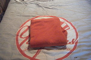 5) Bring the bottom of the shirt up slightly above the collar of the shirt.
http://www.wikihow.com/Fold-a-Shirt-with-the-Department-Store-Method
How to FOLD a shirt


1) Lay the shirt down with the back facing you and flatten it evenly.

2) Bring one armlet over to the edge of the fabric, so that the arm lays vertically down the crease of the shirt. (You may also bring the armlet straight over, as this will not hurt the end result.)

3) Do the same with the other side, folding the armlet over to the vertical portion of the shirt.
4) Fold the other side of the shirt to this same center, but do not let this side fully criss-cross over to the other folded side. (Slightly tipping overlapping is okay.)

http://www.wikihow.com/Fold-a-Shirt-with-the-Department-Store-Method


