
Tuesday, 21 January 2014
Practical// Evaluation
What skills have you developed through this module and how effectively do you think you have applied them?
With there being no stock in the print room I had to think of new and different print process. For one that I will explain in better depth further on in the evaluation, the centre labelling that was meant to be printed on a sticky matte. I had to think of the next best thing and in a result I printed on vinyl. This being the first time I wasn't sure what to expect but I was very happy with the final outcome. This will defiantly be used again in the future with other projects.
This has been the first time I have designed for a 12" sleeve so I was not that familiar with the folding technique. Then again in the past I have had much experience with the 7" so at the end of the day it was basically that but bigger! I very much want to do more work around this area as its what I most enjoy.
In terms of the dissertation, I have never been part of something so big and time consuming. However, considering it being written work, I enjoyed the process and discovered I have learned a great deal in this area. I can't exactly see my self producing a essay again of such size but if the time comes again I will be prepared!
What approaches to methods of design production have you developed and how have they informed your design development process?
Design boards are by far the best way to go about starting a project. It means you can get everything in you head out on to paper and in a result you can clearly see everything you have been thinking about. In terms of design development, it must alway begin with design boards as this will set the foundation to any design and project. The design development has been clearly documented on my blog so you will be able to see whats been going on. The development changed tremendously because of the stock situation!
The dissertation was quite hard to come up with during the summer holidays. Despite having to hand in a form about an idea of what the title might be I had no idea. I then decided to again, like my practical, produce design boards about what I liked in design. Music and the album cover had to be the number one thing, but I wasn't sure how I was going to go about making a whole dissertation about it. As the summer went on a kept on finding more to talk about and the title started to take shape. I firstly constructed a 2000 word essay on Strom Thorgerson and Aubrey Powell, talking in depth about there most famous work.
The dissertation was quite hard to come up with during the summer holidays. Despite having to hand in a form about an idea of what the title might be I had no idea. I then decided to again, like my practical, produce design boards about what I liked in design. Music and the album cover had to be the number one thing, but I wasn't sure how I was going to go about making a whole dissertation about it. As the summer went on a kept on finding more to talk about and the title started to take shape. I firstly constructed a 2000 word essay on Strom Thorgerson and Aubrey Powell, talking in depth about there most famous work.
What strengths can you identify in your work and how have/will you capitalise on these?
During this brief I kept thinking of how I was going to print my work. Especially considering the print room didn't have any stock in that I was familiar with. My four page album cover went wrong because there wasn't the right paper in stock and this album cover happened to use the rest of the laminate paper! I then decided to print on a card with two different covers and the result was successful.
I was under a huge amount of stress when the 4 page album cover didn't work as I believe it would have worked if the right stock was around. I was very quick to come up with the next best thing when it was most needed and I think this has been something I hope to do again the future. You never know what might go wrong in your work, in this case i don't think I have myself to blame! I hope that when it most matters I will keep my cool and make sure I think of solution.
Experimenting with different print processes is something a rarely do. I do my best to avoid it so that I avoid error. I have learnt that it is very important to try new processes. When it came to my centre labelling I didn't have the paper I needed. That being a laminate matte. I then managed to find some white vinyl paper and this worked very well for me and for the final outcome. In the future I will make sure I experiment with different print processes.
What weaknesses can you identify in your work and how will you address these in the future?
Time management has been a weakness in this module. The hand in for this came extremely quickly and having it right after the christmas holidays cause me to have a lack of motivation during the first week back. In the future I believe the college should consider moving the hand in date to a later date.
I have already addressed the fact the print room didn't have any stock. But this must be mentioned again as this in some ways has been a weakness towards my work and in the end towards the final outcome. During the last days I was very, very rushed. Nothing seemed to be going right and there being no paper to print on that I knew about almost lead to giving up! The four page album cover going wrong two days before hand in for example.
This caused my presentation boards being printed right before hand in, not ideal in any way. My macbook decided to crash and I was forced to print out boards that were pixelated and probably full of spelling mistakes. If I'm brutally honest, I am usually very good when it comes to handing in work. This has been the first time during my time at the college and I defiantly don't want to experience anything like it again.
Next time I must make sure I get everything done in good time. If it isn't, the worse can happen, like your macbook giving up. This really made me lack all confidence as handing in something you don't feel 100% with really isn't the greatest feeling.
Written work has always for as long as I have lived been my biggest weakness. Essays and in my case, my dissertation, were not easy. I was however writing about a subject I love and admire so finding the motivation to work was most of the time very easy. Much easier than finding the motivation to write about urbanisation in Paris. For the most part I am very pleased with my final hand in for the dissertation. I am a very slow writer and most of the time reader so the time I put in is staggering.
I worry for typos in my dissertation, spelling mistakes and errors with grammar is something I seem to always do. This meant at the hand in I was terrified there would be mistakes throughout out the whole dissertation. When you have worked on something so hard for a long period of time this feeling is horrible! In the future, I hope for someone who's job it is to read through my daft mistakes!
Out of FIVE
Attendance : 5
Punctuality : 3
Motivation : 3
Commitment : 4
Quality of Work Produced : 3
Quantity of Work Produced : 3
Sunday, 19 January 2014
Practical// Final Prints


Overall I am very pleased with my final outcome but the journey to the finish has been very bumpy.
Firstly my printing was delayed massively because the print rooms had no stock that I needed in order to get a good finish. This meant I had to wait around spending a lot of money printing on different paper that I was not familiar with.
The centre labelling, as you have read, was not meant to look like it looks. That was something I had only a couple of hours to sort out. I was informed the sticky matte paper I need would be here by Friday lunch time so I decided to wait, cutting it vert fine. Unfortunately, the paper didn’t arrive so I had to act fast and come up with a new simple design.
Next time when it comes to printing, I want to discover where else prints in Leeds so that I can always get a finish that I will expect! I very much enjoyed the practical side to the dissertation as album art work is potentially an area I want to work in.
Friday, 17 January 2014
Practical// New Centre Labelling


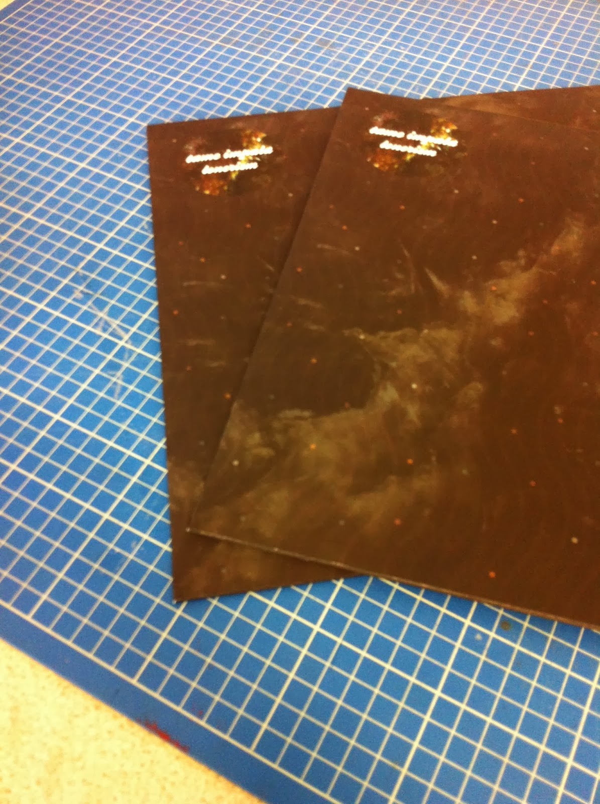
Considering I only had a short morning to fix the centre labelling I am very happy with the outcome! I was told to wait for the right matt laminate paper to come in but it never did so I had to act fast and design something new quickly.
This has been printed on white vinyl then cut in the vinyl cutting machine. Above is an example of the A. As you can see it the outcome is quite effective. The only problem I have with this is you can't see what song is on each side
Thursday, 16 January 2014
Practical// Album Cover and Lyric Sheet Ready for print
Cover One// A & B Side

Cover Two// C & D

Lyric Sheet (Double Sided Pull Out)

Once these are printed they will be joined together by putting them inside a plastic casing that will have the sticker of Tame Impala placed on the front. Ideally I wish the doubler sided album cover worked as it would have made more sence in terms of packaging the two records. However it hasen't worked and I have gone and done the next best thing. The double sided album cover is very much something I want to create in the future. Maybe it is something I will have to send off to get printed who knows.
The above will be printed on a card. The matte didn't seem to work for me. This card will then be laminated. However the pull out sleeves will most likely be on a matt as having a more flexible stock will make it easier to put in and take out of the outer sleeve.
Practical// New Idea// Two Separate Album Covers


After the double page album cover going wrong. I had to get back to the drawing board and think of something new. Luckily enough for me the solution was very simple and not massively different to my original idea. i decided to go ahead and design two different album covers. This mean't I would be able to print on a thicker card and I was also familiar with printing and folding this sort of packaging.
There will also be a pull out sleeve that will contain the lyrics and information about the band.
Practical// 4 Page Album Cover Printed


Unfortunately, this didn’t work at all for me and I had to come up with a new idea. I decided to print on a thin matte because it folded easily. I then laminated it to make it more durable.
The problem was the final outcome was way too soft and limp meaning it lacked structure. For some reason because of its net, the inner sleeve wouldn’t fit properly inside the cover packing and it was after this I decided to think of something new.
This was a shock as this had been the initial idea through out. When this didn’t work for me it was hard to think of what to do next, However, it was a relief when I decided to keep it simple and make to separate album covers. One for the A & B side and one for C & D side.
Tuesday, 14 January 2014
Practical// Printed Inner Sleeve


Here are my printed inner sleeves. Overall the outcome is fine. The only problem which faced me when I was printing was the print room didn't have any fireproof paper in stock. This is the paper I really needed to print on because it's the most durable and flexible stock in the print room. Ideal stock for an inner sleeve. The problem with matte, which in this case I printed on , is it's easily ripped and the ink smudges even when dry. When taking the inner sleeve out of the outer packaging it will be handled a lot and will smudge over time. That and the persons hands will get inky!
I don't yet know how it will cope in the outer sleeve, it might be very tricky to put in and take out. Which annoys me as when people take it out to look it will be a hassel and will most likely be damaged in the process.
Monday, 13 January 2014
Practical// Inner Sleeve
'Lonerism' is to be connected with space and the universe. The feeling of wanting to being alone and isolated.


I love how the macro photograph of the rock looks like clouds in this design. I think this is now perfect for the inner sleeve design. I have connected 'Lonerism' with 'Space'. I think the too go hand in hand. The feeling of there being nothing in space and if you where out there you would be on your own.
Practical// Inner Sleeve First Examples
Example ONE:

I came up with this as a first example. I didn't exactly know what I was going to produce, I guess thats a good thing when you are trying to design a pattern as you don't know what to expect. This has come out alright, could be better. I think the lines make it seem to hard and unforgiving. I want something that will flow and suit the music of Tame Impala.
Example TWO:

This example is much more suitable. The lines are only on an opacity of 3% and personally it think they are still too visible. However on my Illustrator file you can barely see them. Still not 100% happy with this design. I need to make these lines fit more with the design as at the moment they are too bold and interrupt the rest of the design.
Example THREE:

The lines this time are just on an opacity of 2%. Two of the lines for some reason seem to be of a higher opacity so I will need to go back and work on that. I don't know if I like this that much, I like it but don't know if I want it for the final inner sleeve. I want there to be more colour. I also need to put it next to the outersleeve and see if they work well together.
Things left to do:
- Download card (This is given to you so you can download the digital version of the album
- Finish inner sleeve! ( This will hopefully be printed tomorrowso I need to make sure it is done to a standard I am happy with and printed on a decent stock.
- CD Cover? ( Do i need to do this? I have never constructed one before so this could be worth my while)
Practical// Innersleeve Secondary Inspiration
Geowall


This design I found when having a look on designspiration. Its a simple yet effective vector based design. It's these continuos and repetitive shapes that I initially think will make a perfect design for my inner sleeve. I do however want to achieve more depth in this design. This, to me, seem very hollow
Todos os tamanhos

This design makes a 2D image look 3D. I believe that is what attracted me to it. That and its colour range works well with the design.
Universe// But does it float

Looking at this I'm not too sure how this design has been constructed. I found this on butdoesitfloat.com and this website and some truly lovely work on it, spanning from photography to pattern design. I was going to say this was simply done on Illustrator but after looking through does it float all of the work (apart from the photography of course) has been hand rendered. Possibly the example above has been done using different paints?
Love to Hate

This example above is a very easy design to do and very effective. The colours however I don't agree on to much. The colours in the example above this one are the sort of colours that I want to go with. especially considering that album cover is of a dark colour. I wouldn't want to inner sleeve to be really bright and dominating.
Space// But does it float

I like the idea of doing something to do with space. I feel this links with the title of the album 'Lonersim'. I want to look more at this. I might be able to find some very nice examples of space illustrated in the internet that will give me some ideas to plat around with. This example above was also found on butdoesitfloat.com. From looking at this site further it has so much fascinating work on it. ]]
Northen Lights

This is a long exposure shot taken of the Northern Lights. Overall from this photo you get a very dreamy and psychedelic outcome which would work extremely well as a design/ photo for my inner sleeve. The only tiny problem is I can't exactly take a photo of the Northen Lights. What I can do though is make a design inspired by the northern lights.
Nicholas Alan Cope Photography

Amazingly, this is a photograph. I can't exactly see how though. To me this looks like a very long exposure photograph that has then been optimised on Photoshop. Where the black is visible I think stars have been taken out. In a result you get a result very similar to the inside of a crystal rock.

This is another photograph, I keep on coming across them and being inspired to create something similar. "every day, for the next 25 days, a new photo will be revealed here from the Hubble Space Telescope, some old and some new..." I stumbled across this photo on a blog. The blog took me to a website site that everyday (during a time period) they uploaded a photograph of space. This example above was my favroit example I could find.
Sara Lindholm

This photograph was taken by Sara Lindholm. After looking over Sara's tumblr she is a photographer that exapands here work over many categories, from fashion to something like like above (I want to say landscape photography but this is obviously a portrait photograph). From this and the 4 examples above I very much want to achieve something like this in my design. I love the feeling it gives, the feeling of escapism is a very strong feeling. This is the feeling I want to get through in my design. This is what the listener will feel when listening to the music.
Practical// Stickers


Practical// Re-size Album Cover

From measuring a selection of covers I found out that my album cover was sized wrongly. At first I was working to a size of 30.5cm X 30.5cm. The actual size is 31cm X 30.5cm. This means that the record will fit better especially when in its inner sleeve.
HIGHT: 31 CM
WIDTH: 30.5 CM
Sunday, 12 January 2014
Practical// Centre Labelling
Centre Labelling

Considering this is the first time I have mocked up a 12 inch record I didn't know what size anything was. I wasn't that keen on getting my informtation over the internet so thought it wise to get the information myself. The center labelling for the record above is 10cm x 10cm. This is this size I will be going with.
...................................................................................................................................................................


At the moment my centre labelling is very simple. (may I point out quickly that the white strokes won't be on the final print). The white text works wonders against the background and this has given me great confidence with this. I could go ahead and play with some other designs but I'm not sure its necessary. considering that the background is visually very attractive it does the job very well.


Subscribe to:
Posts (Atom)