My presentation was terrible. I think I finished in 2 minutes instead of 5. This is something I need to inprove but when I presenting my mind goes blank and I forget a lot. I HATE PRESENTING. Its horrible. For some reason I don't have the confidence to enjoy myself.
Wednesday, 28 March 2012
Theory Into Practice// Research
Visible Signs - David Crow
Books
Books
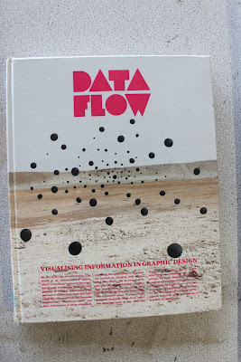
There are as you can see 9 stages to his book. I am not going to be able to go into all these areas so I am going to pick a few and go into them. ‘The
book
Explores the mechanics of visual language in an attempt to help to understand
how visual communication works’
Date Flow
This part of the book looks at how different parts of the world look at everyday things like, for example, dogs. obviously, visually dogs look the same where ever you go in the world. But the name is different. That where signs come into action. Take every day signage into this. Think of airports, signs are designed to communicate a simple message to the viewer no matter where they are from in the world. Look at the example below this: Encoding/Decoding Model. They are simple, legible signs.
Encoding/Decoding Model:
I want my paper to fill filled with signs like this and their meaning. I am pretty rubbish with the pen tool so this is going to be really good practise for me. I want my publication to have famous quotes about semiotics too but I'm not sure if I will be aloud to do that! I will have to check with the tutors to see if it will be ok. Below is
"...Stuart Hall developed the encoding/decoding model. “The basic premise of Hall’s encoding/decoding model of communication is that the media apparatus has an interest in production, circulation, distribution/consumption, and reproduction rather than conveying a message.” Hall’s encoding/decoding model focuses on the ideological dimensions of message production and reception in a capitalist world..."
For my front cover I might just have an arrow with a black background. An arrow is as simple as signs go. We can tell from right, left, straight on or backwards. Its simple signage. The example above this I managed to find on google images. I have to say some of these signs I don't understand. The 'E' and the 'B' aren't legible, and the 'A' 'C' 'D'. I like the elevator example here. Its simple some lines cleverly peiced together to create meaning. Thats what I like about transport signs
These books will be the heart of my research as they contain all the information I need to know. Visable Signs by David Crow breaks down semiotics and gives very interesting examples and diagrams. In my publication I intend to quote from David as his definitions make semiotics easy to understand. I fear that the publication will turn in to another david crow book but I'm sure it won't. I intend to word it myself, but I feel I should quote from david.
West of England Design Forum.
I found this and it gave me the idea to think about colour in my publication. Traditionally, newspapers are quite dull and boring but I like the idea of making the colour visually pleasing. Almost make an unconventional paper. I say unconventional because the paper would be going against these traditional rules of dullness! Out of the examples above I like the yellow one, navy one and white with pick one. My orinal idea was to just have a black and white paper but I am strongly against that now as I feel having colour will bring the newspaper out and attract a wider audience so to speak. Its not every day you see a colourful newspaper. There was no designer name or even a description to what these are but they look like postcards that promote the 'West of England Design Forum'.


Loud and Quite magazine
Publication

I did consider making posters for my idea but thought making a newspaper would be a new experience and would in the end look as a better a final design. Loud and Quite is a free newspaper from leeds looking into the music scene and its good research. I think the main thing about newspapers are they are very cheap to print and put together correctly can look fanastic. This sort of magazine is completely different to a normal conventional newspaper like 'The Times' for example. This publication has been put together to look fresh and simple. Newspapers like 'The Times' have to fit a lot of information into them which often leaves them messy and unlegible. Newspapers like 'Loud and Quite' have a target audience of young people- Possible THE main reason why it has this particular layout. In Media during sixth form I learned that stereotypically teenages have a much shorter attention span that adults or teenagers from past generation and from this magazines have become simple with a large image and little text. This is just a theory but it might be true!
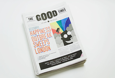
The Good Times
'The Good Times is a Church of London's response to the January blues and the result of a week long project to write, design and print a one off newspaper which celebrates only good news. In the seven days leading up to todays publications date ( which according to the dubious claim of an ad campaign from a few years ago, is the 'most depressing days of the year*) TCoL rallied writers, designers and illustrators together to produce a newspaper which exclusively features 'good news' stories...'
website : creativereview/the-good-times-newspaper
...............................................................................................................
Presentation Boards

Presentation boards for first crit
...............................................................................................................
Labels:
OUGD401
Friday, 16 March 2012
Theory Into Practice// Ideas
I am still unsure what I want to do for this task even after looking through my blog for 10 pieces of design that I liked and wanted to take further than just secondary research. I didn't bring in lectures into the equation so I have gone back again through my Design Context blog to identify what Lectures I found useful.
Lecture 4:The Auteur- This lecture was all about film and film making. We went though film maker, types of shots (filming), and the general history of Film. This lecture was quite similar to Lecture 6: Italian Vernacular Cinema. Again we were taken though the history and different types of shot- How a shot can make you feel a certain way.
Looking back though the ten pieces of design that I liked its mainly to do with type and publications. Maybe type is the area I can move into. I can see stamps and posters too and at the end I have a letter-pressing video from camberwell arts college. The best thing to do is identify two subject and then merge then together to make my own design. I find this quite hard even after the workshop with joe. I came out feeling uneasy about my ideas and put the task in the dark.
I do know that I want my final outcome(s) so be either posters or leaflets. At the moment I find hotdog books the funnest as I like the idea of having a selection of designs neatly tucked away in a small book. Possibly thats something to look into? Learn how to make a real book- Book Binding.
Layout is something else I can find out of my work. Type, layout, imagery. 3 of the designs that are on my chosen 10 only have a 2 colour tone range, one of these designs being an embossed stamp. Not all of the 10 things are designs- I also have some written elements that intrigued me. Such as...
'"Laugh" 'People visiting the studio often comment on how much we laugh. Since I’ve become aware of this, I use it as a barometer of how comfortably we are expressing ourselves' - Bruce Mao
&
'Some people walk in the rain, others just get wet' Roger Muller
Often quotes are a good source of material and can be a good starting point. For example I had 'Honesty is the best Policy' and I had to do my best to respond to that and that is only a sentence. From that sentence I had to break it down and figure out what to design.
I am tempted to take one element from a lecture and then go with type or grid. Again at this stage I am finding it really hard to come up with something and I'm feeling very rushed. I fear I am going to be dropped into something I don't like. Thats the problem with making up a brief for yourself, it makes you think to much about what it is you want to design (as you are looking to find your strengths).
Labels:
OUGD401
Wednesday, 14 March 2012
Tuesday, 13 March 2012
STAMP IT!// Research
Little Red Riding Hood
'...On my way home, I happened to pass a “Stamp Fair” which sold all sorts of pretty stamps from all over the world for ridiculous amounts of money (especially considering, that you really don’tneed Finnish stamps in Japan). To my big surprise, I got totally sucked into this bought more than anybody else!'
Ok so this might not be a British stamp but I think its important to look at different countries and how their stamp look. I will be perfectly honest and say that this stamp is way 'cooler' than our current one today. However the stamp we have today is legible and perfectly acceptable. The Queens head is symbolic of our nation and can probably be understood by the world. Looking at the design though, I think its wonderful, it has elements of child book illustrations. I really like the '7' too. The whole stamp with its colour and overall design looks retro, like something from the early 90s. Unfortunately I can't find a designer which doesn't surprise me. Then again heres a question. Who designed the british stamp?
Rowland Hill
Website : inventors.
Letterology

This is a lovely example of a stamp. The embossed effect here reminds me of a manor house or of a castle for some reason. I think because it has that 3D effect and because most catles and manors houses somewhere around then have this. I like the blue that is fading and the paper it has been printed on. The paper reminds me of that recycled paper you can buy.
Letterology : letterology.blogspot
US Postal Stamps
This is strong secondary research. GO GREEN is a set of stamps that inform people of how to save energy. Some of these I like. Fix Water leaks is something I would have never thought of. And simple ones like turning off light switchs. The illustrations are perfect in a sense they are clear, legible and in all simple to understand. I found this set of stamps on BEHANCE and looking through the site there is much more of where this came from.
Behance US Stamp : behance/ US Stamp
Gavin Martin
Rowland Hill
So Rowland is said to be the man to design the first British stamp!
Some facts about the stamp itself:
...the Penny Black was the first stamp to be made. This stamp was made in May 1840 and was issued by the United Kingdom of Great Britain and Ireland for official use. The postage stamp had a price value of 1 penny. The Penny Black is not a rare stamp as such but since it was the first stamp the world saw, it is included in the list. 68,808,000 copies were made for this stamp in total. The stamp shows the side pose of the young Queen Victoria...' smashinglists.
Rowland Hill was a school master and he invented the first stamp in 1837! an act for which he was then knitted. He also went on to create the first uniform postage rates that were based on weight rather than size. In terms of design this doesn't really scream out to me. Its very simple. I do like the lines going down the sides. The font used is also quite nice. Then again Rowland was probably the person who came up with the queens side portrait and that is something else. That means this design hasn't changed since it was first invented more than 100 years ago. Incredible that.
Letterology

This is a lovely example of a stamp. The embossed effect here reminds me of a manor house or of a castle for some reason. I think because it has that 3D effect and because most catles and manors houses somewhere around then have this. I like the blue that is fading and the paper it has been printed on. The paper reminds me of that recycled paper you can buy.
Letterology : letterology.blogspot
US Postal Stamps
This is strong secondary research. GO GREEN is a set of stamps that inform people of how to save energy. Some of these I like. Fix Water leaks is something I would have never thought of. And simple ones like turning off light switchs. The illustrations are perfect in a sense they are clear, legible and in all simple to understand. I found this set of stamps on BEHANCE and looking through the site there is much more of where this came from.
Behance US Stamp : behance/ US Stamp
Gavin Martin
Again this work has been found on Behance. Simple illustrations but they work very well.
'Project to create a set of stamps based on 6 'British Firsts'. I chose to base mine on achievements of British Universities. I wanted to create something different from the typical stamp sets out there..'
This is not the same theme as I am doing but taking away and looking at the design is useful to me. I admire how he has put the queens head on them. It makes it obvious that its a stamp. If the head and the '1st' were not there it would be much harder to identify.
Gavin Martin//Behance : behance.net/Stamp-Project
Postage Stamps for RSA design competition
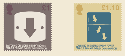
These I really like. Nice designs and the text works well with the imagery. The only thing I have wrong with them is when they are a stamp they are small. I fear that when these are the size of a standard stamp the text will be un-legible. Then again if you really try and read it I'm sure you can!
'This series of 6 stamps was created for the design competition set up by RSA. The purpose of the stamps is the reminder of the simple methods we can use to save energy in our homes and help the environment...' - Quote & Designs
Fanoi Thaqi is a third year graphic designer studying at plymouth university. Looking through his blog on Behance its quite clear that he has a strong idea of what he is doing!
Fanoi Thaqi//Behance - behance.net//noli
I was lucky to come across these designs on NeatDesigns. The middle ones I like the most, although its not the type of design or look I am going for in my stamps it still quite nice to come across work in the same area and thats as nice as they are. I love the top designs the most. The embossed look and the card they have been printed on makes such a difference to the final design. This is something I need to work out when I go to print. I need to identify whether or not I can cut my stamps in such a way to make them look like real stamps.
Website : neatdesigns
Labels:
OUGD406
What Is a Line?// Research
Lauren Alexander
As I want my what is a line final outcome to be a small book publication I decided to look in to books with simple but effect covers like this example above. Its not quite what I want but its the right idea. A bland cover with simple smart type. Its to inside that will have all the detail. Heres Lauren's talking about this comic book 'Short political stories based on true life events, one in english and one (read from right to left) in Arabic. This comic book is based on a conversation The publication was shown in the exhibition space as an installation. As an additional layer above the drawings we projected the conversation text which we also used as the content of the book...' -Quote
Lauren Alexander blog : laurenalexander
Johannes Konig

This is slightly to heavy in the colour department but I like the fonts used in this. It also has this old fashion effect which I quite admire too. It looks aged and work. I like how the pages are shining out as if the paint is still wet. This is research for the front cover. I know the sort of look I want but I still want to look around in books and the internet until I find something similar to what I want. i wouldn't say this is copying or cheating, but I'm sure many a designer would agree with me when I say its nice to see a piece of work you want to accomplish that a designer has already succeeded with. It makes you more confident with yourself and the brief you are trying to tackle.
Website//DesignSpiration : Johannes Konig
Paul Tebbott

THIS is very much what I want my the inside of my book to look like. Remembering that the three words I have to respond to are Publication : Country Side : Horizons. The horizons are what link with a line as a horizon is technically a line. I am going to try and cut my way around this though as I would love to produce like this by either using card or simply using CS. I want the work in the book to be slightly more worn than this though,. I feel this work comes across to clean and in someways bland. It doesn't matter how old a design is but when you make it look worn you get this nostalgic effect. Almost like using an old film SLR today.
Paul Tebbott//DesignSpiration : designspiration
Head of State
This design is just what I'm looking for, It might be slightly too perfect to run with but I love the font and the colours. I am in the process of doing my cowboy/wester desert design and I am finding it quite hard to find objects to fill the space. I am also working to A3 this time so I am going to have to find a bigger scanner to proceed on photoshop.
Head of State : theheadsofstate.com
Matthew Lyons

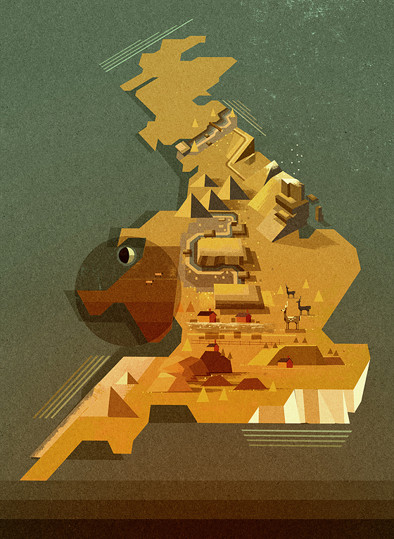
I always seem to come back to Matt's work and its been throughout the year too. When it comes to this sort of look I am trying to achieve I can only think of his work as secondary reference. I love how you get that effect from the sun as if you are actually looking at the sun yourself. The way he has made the whole design look like its been done with sponges and paint to give it the beautiful but effect de-saturated and worn effected. This is the nostalgic look I have been looking for this book. In order to create this effect I might just do everything on card first..and then scan the work in and play around with filters and rubber tools on photoshop. This might seem like the simplest way to do it, but its the most effective way to do do it. I can change the look an feel of a design in minutes.
Matthew Lyons : matthew-lyons
Luke Pearson


This guys work is some what very similar to Matthew Lyons. He is also a member of the NoBrow family and he is also fantastic. The design above is fantastic. I love the font he has used and I think I am going to play around with this idea for the front cover of my little book. The font i would say was hand rendered and than put on to illustrator. I might have ago at doing this mys self however I am not to sure How good i will be. Another expect to this design that I like it the block shapes he has going. They are positioned quite well and work at break up the peice. And of course the design has been inspired by Snoopy and you can see that the book shelved have been positioned to form a perfect triangle. Just like Snoopy's dog house. I have only just clocked on to this but It feels like I have known this since the first time I looked at the design. Please follow the link below to look at his other work as you won't be disappointed!
Luke Pearson Website : Luke Pearson
Josep Roman Barri

I like the idea of having the front cover similar to this. Its mad to think that this tiny insignificant line is playing any role to the design of this book cover but in actual fact it is. If this was just a book cover by itself it would be completely different and have no effect the the audience. This line is almost suggesting that there is content in side, against there being no line suggesting that this book is empty. I found this on DesignSpiration and the designer behind this is Josep Roman. Follow the link underneath for more information regarding the work and the designer.
Josep Roman Barri/DesignSpiration : designspiration.40331
Ryan Gillett
Colin Dunn : grainedit/Colin Dunn
Head of State
This design is just what I'm looking for, It might be slightly too perfect to run with but I love the font and the colours. I am in the process of doing my cowboy/wester desert design and I am finding it quite hard to find objects to fill the space. I am also working to A3 this time so I am going to have to find a bigger scanner to proceed on photoshop.
Head of State : theheadsofstate.com
Matthew Lyons


I always seem to come back to Matt's work and its been throughout the year too. When it comes to this sort of look I am trying to achieve I can only think of his work as secondary reference. I love how you get that effect from the sun as if you are actually looking at the sun yourself. The way he has made the whole design look like its been done with sponges and paint to give it the beautiful but effect de-saturated and worn effected. This is the nostalgic look I have been looking for this book. In order to create this effect I might just do everything on card first..and then scan the work in and play around with filters and rubber tools on photoshop. This might seem like the simplest way to do it, but its the most effective way to do do it. I can change the look an feel of a design in minutes.
Matthew Lyons : matthew-lyons
Luke Pearson


This guys work is some what very similar to Matthew Lyons. He is also a member of the NoBrow family and he is also fantastic. The design above is fantastic. I love the font he has used and I think I am going to play around with this idea for the front cover of my little book. The font i would say was hand rendered and than put on to illustrator. I might have ago at doing this mys self however I am not to sure How good i will be. Another expect to this design that I like it the block shapes he has going. They are positioned quite well and work at break up the peice. And of course the design has been inspired by Snoopy and you can see that the book shelved have been positioned to form a perfect triangle. Just like Snoopy's dog house. I have only just clocked on to this but It feels like I have known this since the first time I looked at the design. Please follow the link below to look at his other work as you won't be disappointed!
Luke Pearson Website : Luke Pearson
Josep Roman Barri

I like the idea of having the front cover similar to this. Its mad to think that this tiny insignificant line is playing any role to the design of this book cover but in actual fact it is. If this was just a book cover by itself it would be completely different and have no effect the the audience. This line is almost suggesting that there is content in side, against there being no line suggesting that this book is empty. I found this on DesignSpiration and the designer behind this is Josep Roman. Follow the link underneath for more information regarding the work and the designer.
Josep Roman Barri/DesignSpiration : designspiration.40331
Ryan Gillett
Ryan Gillett is a good friend of mine from Brighton and I was around when he was making these hotdog books which have actually turned out very successful being mentioned on blogs and websites. He went back to his university to screen print these books and i think he did around 25 of them all double sided. One thing I am not doing for my hotdog book which he has done is a band to wrap the book up in. Thats the sort of thing that really finishes a hotdog and makes it feel complete and smart.
Please visite his blog and take a look at his work
Ryan Gillett Website : ryangillett.com
Colin Dunn
Just came across this and I wish I had seen it earlier. The first two pages have to pirate themed design and I wish I had done the sea on two different layers because looking at this design it has worked really well for him. The top third of the design has this lovely grainy white which gives the work age. The first two pages I don't quite understand in terms of what it is saying 'not seeing me'. However I love the look and feel of it. You can identify certain blocks of
Labels:
OUGD404
Subscribe to:
Comments (Atom)


