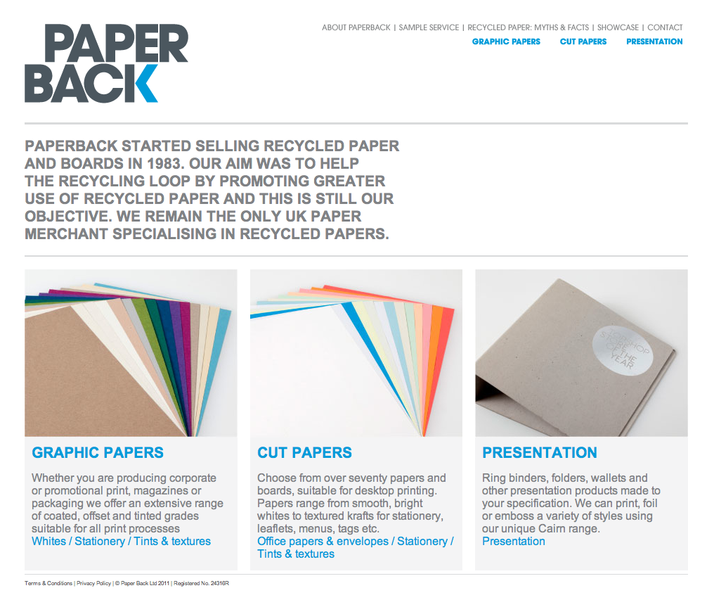
Monday 29 October 2012

Design for Print// Primary Research


I wanted to order some samples from these companies because I am really interested in what sort of printing techniques people are using today. I would love the opportunity to experience business cards etc. that I can actually hold and admire. Instead of looking at them over the internet! I would be good primary research and I think give me a better idea of ways I am execute my own work .

...................................................................................................................................................................


NOPE! Annoyingly I couldn't get any samples from GFsmiths, they recommend to talk to my tutors.

Lecture TWO// Panopticism


Literature, art and their respective producers do not exist independently of a complex institutional framework which authorises, enables, empowers and legitimises them. This framework must be incorporated into any analysis that pretends to provide a thorough understanding of cultural goods and practices.  Randal Johnson in Walker & Chaplin (1999)
Lecture Aims : 
UNDERSTAND THE PRINCIPLES  OF THE PANOPTICON
UNDERSTAND MICHEL FOUCAULT’S CONCEPT OF
  ‘DISCIPLINARY SOCIETY’
CONSIDER THE IDEA THAT DISCIPLINARY SOCIETY IS A WAY OF MAKING INDIVIDUALS ‘PRODUCTIVE’ AND ‘USEFUL’
•UNDERSTAND FOUCAULT’S IDEA OF TECHNIQUES OF THE BODY AND ‘DOCILE’ BODIES

The Panopticon 


Michel Foucault
(1926-1984)
Madness & Civilisation
Discipline & Punish: The Birth of the Prison
THE GREAT CONFINEMENT (late 1600s)
Houses of correction to curb unemployment and idleness


The Birth of the Asylum
The emergence of forms of knowledge – biology, psychiatry, medicine, etc.,  legitimise the practices of hospitals, doctors, psychiatrists.

Foucault aims to show how these forms of knowledge and rationalising institutions like the prison, the asylum, the hospital, the school, now affect human beings in such a way that they alter our consciousness and that they internalise our responsibility.


That you be drawn on a hurdle to the place of execution where you shall be hanged by the neck and being alive cut down, your privy members shall be cut off and your bowels taken out and burned before you, your head severed from your body and your body divided into four quarters to be disposed of at the King’s pleasure.


DISCIPLINARY SOCIETYAND DISCIPLINARY POWER
 Discipline is a technology [aimed at] how to keep someone under surveillance, how to control his conduct, his behaviour, his aptitudes, how to improve his performance, multiply his capacities, how to put him where he is most useful: that is discipline in my sense (Foucault,1981 in OFarrrell 2005:102)


Jeremy Benthams Design The Panopticon
   Proposed 1791


   The Panopticon internalises in the individual the conscious state that he is always being watched
The idea of always being watched so your behaviour changes radically:

 Reforms prisoners

Helps treat patients
Helps instruct schoolchildren
Helps confine, but also study the insane
Helps supervise workers
Helps put beggars and idlers to work.


•What Foucault is describing is a transformation in Western societies from a form of power imposed by a ‘ruler’ or ‘sovereign’ to……….. A NEW MODE OF POWER CALLED “PANOPTICISM”


•The ‘panopticon’ is a model of how modern society organises its knowledge, its power, its surveillance of bodies and its ‘training’ of bodies.


 MODERN DAY


Richard then went on to talk about how this effects people in modern day environments, for example to office. Offices are usually laid out so the manager and see what is going on. He can see all of his employes 


The office, they know they are constantly being filmed by a film crew making a documentary so they change the way they usually work. They work so to look busy and professional when in actual fact they would never work in this way,. 


Richard then compared this to pubs and clubs. In pubs the atmosphere is much more relaxed and you can hide away in dingy corners when in modern day clubs the style is much more open so you feel like you are being watched.

Pentonville Prison


 Children were positioned in cubicles so they could socialise with anyone around them, the tutors were then positioned in a way that all of them could be seen.

RELATIONSHIP BETWEEN POWER, KNOWLEDGE AND THE BODY.

   ‘power relations have an immediate hold upon it [the body]; they invest it, mark it, train it, torture it, force it to carry out tasks, to perform ceremonies, to emit signs’ (Foucault 1975)
Disciplinary Society produces what Foucault calls:- docile bodies.
Self monitoring
Self-correcting
Obedient bodies

Disciplinary Techniques

“That the techniques of discipline and ‘gentle punishment’ have crossed the threshold from work to play shows how pervasive they have become within modern western societies” (Danaher, Schirato & Webb 2000)


Nazi Sports event : CULT OF HEALTH 

Nazi degenerate Art Exhibition 1937
His definition is not a top-down model as with Marxism

power is not a thing or a capacity people have – it is a relation  between different individuals and groups, and only exists when it is being exercised.

the exercise of power relies on there being the capacity for power to be resisted  

Where there is power there is resistance


Chris Burden  Samson (1985)


Key things to go away from the Lecture with:

•Michel Foucault
Panopticism as a form of discipline
Techniques of the body
Docile Bodies

Monday 22 October 2012

The Gaze and the Media// Richard's Workshop & Task


Wonderbra 


I can't cook, Who cares? This advert is saying that who cares I can't cook look how amazing I look! This makes this woman look extremely powerful.  The question is, who is this advert aimed at? A male audience or a female audience. I would say it appeals to both genders. The male audience for example, will buy the product so that his wife, girlfriend, partner will 'look' like the woman does on this page. The female audeince for example will buy the product because it is a bra and the advertisement makes the woman feel like she can play with mens minds, just like the model is doing in this poster.


Tibalet Cigarettes 


Obviously this doesn't work. 'Blow in her face and she will follow you anywhere'. However, that fact the advert is says THAT WILL happen makes the male audience become very interested in the product. I an only relate it to the Lynx advert, wear Lynx and woman will fall in love with you, angles shall fall from heven etc. 

Thursday 18 October 2012

Design for Print// Costs


Good Time Print 

Considering that these prices are for full colour printing they are very good. For 5,000 A5 full colour leaflets (I am guessing that is double sided) it is only £103.50. If you want to double that to get 10,000 its only £70 more.  
Good Time Print : Goodtime Print & Design in Kent, an economical printing outlet, which has been established for over 20 years, and is run by husband and wife team, Sue and Alan Gregory.We offer full colour digital and litho printing and also provide countrywide delivery service. Talk to us about your colour printing needs, be it for leaflet printing, flyer printing, business card printing, stationery, NCR and more, all at excellent prices.We can provide you with the finest leaflet printing. London may be home to many digital printing companies, but none offer the high quality service and personal touch that we do, ensuring your leaflet printing, business card printing or any other printing needs are catered for in a timely fashion. - goodtimeprintI'm not too sure what 'NCR' means so I need to look into that. The only thing I can't see here is weight size of the paper. This might be something you do later on? 


Design for Web// Website Design Terminology


Animation
The creation of a series of graphic images or frames so that they have the look of moving continuously. This can include simple animation (created using .gif files), the appearance of animation with JavaScript, or more complex animations using Flash.

Broken Links
Hyperlinks, or links that fail to open a web page, usually producing an error page instead.
Composite (Comps)
The look of the website without actually creating it. This is achieved with graphics only, and is usually presented to the client in printed form or as an attachment in an email.

Contact Page
The page in a website that contains all information as to how to contact a business or individual. This usually includes a mailing address, phone number, fax number, email addresses and any other criteria that may be necessary. This page can also include a map and directions.

Content
The body of a web page. Content includes words, selling points, graphics, animations, etc. that do not comprise the framework of the page. This is the information that changes from page to page.

Debugging
Detecting, locating and correcting errors or problems in a computer program or web site.

Design
The process and art of creating a Web page or website. It may involve both the look and mechanics of how a website works. Some of the features that make up design are:
graphic creation
animation creation
color selection
font selection
navigation design
content creation
HTML/XML authoring (known as scripting)
programming (PHP, .net, ColdFusion, Perl, JavaScript)
ecommerce development (requires programming)
Design Process
The method that carries a client and their web designer from the idea of a website to the actual creation and implementation of a website.

Digital Photography
Using a digital camera to take photographs. A digital camera stores the pictures electronically and can then place them directly on a computer. An alternative is to scan regular photographs that have been developed and place them on the computer. Scanned photos are usually not as clean and clear as those taken with a digital camera.

Domain Name
Allows you to reference Internet sites. To register a domain name, you can contact an online company that sells them or you can ask your web designer, Internet Service Provider or site host to register your name for you. A few domain name suffixes (also known as top-level domains) are:
.com for businesses (the most commonly known suffix)
.net for networking companies, ISPs, and Web hosting companies
.org for non-profit organizations
.me for personal sites like MaryMorris.me
.info for information sites
.biz for businesses
.edu for educational institutions
.gov for government institutions
.mil for military institutions
Dynamic Content
Interactive features on a website. The content the user sees is sometimes updated based upon the users input. Dynamic content can be information stored in a database, user input, or even cookies. Forms and a Search option on a site are perfect examples of dynamic content.

Graphics
A picture or image produced on a computer. These can include .bmp (bitmaps), .jpg (joint photographic experts group), .gif (graphical interface format), and .png (portable network graphics).
Forms
Interactive elements which allow a user to input information to be utilized by the website. Forms can be used to gather information supplied by the user in order to help the user interact with various components within the site.

Homepage
The entry page to a website, also known as the index page. Often mistakenly referred to as the "Portal" page.

Hosting
Most commonly thought of as the place (think of a heavy-duty computer) where your website's files reside. An Internet host has a unique Internet address (IP address) and a unique domain name or host name. A host can also refer to a Web hosting company.

Logo
A company's symbol used to "brand" that company in the customer's mind. Think of the "swoosh" Nike uses.

Maintenance
The act of upkeep for a website. This can include updates, changes, re-design, and troubleshooting.

Marketing
The process of planning and executing the promotion of a website via printed and other media, and the Internet. How you make others aware that your website exists.

Search Engine
A program (website) designed to search a database of information from and about other websites. Google, Yahoo and others use this kind of program to create a directory of sites which you can then search through.

Search Engine Optimization
Search Engine Optimization (SEO) is the skill of designing (or re-designing) a website so that search engines will rank it higher for a particular set of keywords.

Server
A computer that delivers web pages to users. It is the "computer" where website files (the whole website) reside and are accessed through the Internet. A server can also be called a host or node.

Target Audience
Groups of people who are considered a marketing strategy's main objective. For instance, toys are marketed toward the Target Audience of children within certain age ranges. Target Audiences can be comprised of one or combinations of different groups. A few examples of Target Audiences are:
Gender-Based Groups
Age Groups
Ethnic Groups
Religious Groups
Political Groups
Testing
Checking a computer program or website for errors. Depending on the complexity of a program, testing (and debugging) can take nearly as long as the actual creation of the program.
Usability
A generic term that refers to design features that enable a website to be user-friendly. This generally refers to how easily a user can find their way around a site. There are five basic components to usability according to Jacob Nielson (known as THE authority on usability):
Learnability: How easy is it for users to accomplish basic tasks the first time they encounter the design? 
Efficiency: Once users have learned the design, how quickly can they perform tasks? 
Memorability: When users return to the design after a period of not using it, how easily can they reestablish proficiency? 
Errors: How many errors do users make, how severe are these errors, and how easily can they recover from the errors? 
Satisfaction: How pleasant is it to use the design?
Usability also refers to the W3C's accessibility guidelines for people with disabilities.
User Testing
The method of studying usability. There are three components to User Testing:
Ask some volunteer users to perform representative tasks with a website design.
Observe what the users do, where they succeed, and where they have difficulties with the user interface.
Allow the users to solve any problems on their own.
The results of User Testing are then compiled and any necessary adjustments are applied to the website design. Testing may be performed one or more times.

Website
A collection of files or "pages" linked together and available for viewing on the World Wide Web (a.k.a. the Internet). Websites are provided by companies, organizations and individuals. 


Monday 15 October 2012

Design for Web// 10 Good Websites vs 10 Bad Websites

10 GOOD Websites


Designspiration has to be one of the most commonly used websites for me. I feel its the best way to discover new and inspiration design from around the world. It does have its ups and downs though. It is very hard to find a name of designer on the website, for example after clicking on a design it is very rare to be linked to a designers website, you are instead linked to a random blog with no mention of who its by or how it was done. However, its very easy to understand and so easy to use.


Creative Review has to be the most famous website/ magazine out there for graphic design & photography. For me, the blog is very much indepth with the design it decides to upload and talk about; You get a real guided tour or the design you are witnessing. Creative Review was the magazine that got me interested with the world of graphic design and I am a regular visitor of the online website & blog.


LostType, such a good way to find the best type around. Must be carful though as there are only a certain number of fonts avaible and I have seen them EVERYWHERE. 'Mission Script' has been rinsed so you might end up producing a design that people will instantly recognise. 


Random, yet you can be lucky to find some real nice pieces of work. I haven't really used it that much but if you dont know where to look, take a gamble as there no end to the stuff you can find here. It isn't just graphic design, it uses video and photography too, as well as fine art. Have a look!


Ffffounf is a great way to discover new and exciting work and has a good link process meaning you can find work that relates to the design you are looking at, of course all blogs use this technique but I feel this blog does it to a greater level of preciseness. Only 'problem' with this blog is there is A LOT of soft porn which seem to 'get in the way' of your practise.


I am very new to this and I managed to find I wide range of design. I discovered it when looking for branding and identity and I managed to find some truly incredible design. They really focus on design that will wow you, stuff that is slightly more appealing to design you might find on blogs like 'design siration' etc. 


Again, something I am new too and I have some sort of addiction to it. You can follow your friends and other deisngers around the world on a mission to find new and exciting work. I have many folders ranging from Photography to Packaging and I can't stop adding work to my page. 

8) Behance


Behance is another blog/website where individual designers have there own page full of their own work. i am not a member but I know people who are. It has a great filtering system which enables you to find what you want straight away.


Here is a french design studio and its what I consider a good website, its very easy to get around and most importantly the work they produce is incredible! They also have a facebook page which you can find here.

10) Nobrow 


I am a big fan of Nobrow as I am a big fan of illustration! the website has beautiful photography and is so easy to get around. It links you to the designers websites who work for them and has a blog which is fun to follow up on.

10 BAD Websites


I would say this is a bad website, because, I don't know one person who uses it? It's simple another wannabe google website search engine that doesn't actually appeal to one single person on the whole planet. I guess I am being harsh as to get around the website is a guess straight forward and the site on a whole is conventional but...why do we need it? Google is the better solution, and the more sensible.


 Layout, colour, design, font, background, all make me feel a little bit sad. I think its the header which does it for me. This has to be one of the worse websites I have ever laid my eyes on! I think they thought, lets just get the idea on the page and not care about what it looks like. In fact, that is defiantly what they thought. 


Thing is, when you make a website you want to make it appealing, you want people to go on it and straight away real like they are welcome and whatever. You enter this website really feel quite bad! I am starting to realise that website that focus around design always seem to be the best ones! 


What the hell do you focus on... this is one hell of a mess. I don't know where to start, I don't know what to do. The links at the top are tiny and anyone who isn't familiar with websites would have no idea what to do. To messy and ineligible. For a website focusing on tourists you have to say, why the hell not get this done properly. I would love to deconstruct this and find the grid because I bet its mental!

5) Sphere


Yet another website that looks like its from 1997, yet another mess on a screen. Thing is is it isn't over the top as in its legible to an extent. Its just extremely ugly. They should so sort it out. The layout is somewhat odd. It looks like it shouldn't look like that, almost like there has been an error with the HTML. Everything looks out of place.


This is hilarious, this website is for a Architect agency who want to DESIGN you house. That must be some sort of joke. You want your website to look something like Imprimerie Du Marais's surly? You want to let the audience know you know what you are doing. The website straight away says to me 'we have no idea what we are doing please go somewhere else'. This is where you can safely say 'You MUST judge a book by its cover'


Considering this is for CHEAP SKATES! I feel this can get away with being crap. The colours are attractive and they have only one thing to care about and that selling skates. I reminds me of the advertisements you get in the back of magazine, all as bad as each other, all trying to grasp the attention of the audience. 

8) Valweb


Another website that looks like it was made in the early 90s. The baby blue background with the green and red type is a sight for sore eyes. Notice all of the links on the top right. Such a muddle of information it very difficult to understand and use. It also looks like the layout is very odd. 


I suppose this website is on boarder line acceptable but then again it doesn't work. Too much going on causing the website to be unlegible. I feel like they should be using the whole of the space avaible too.  


Well this website I belive is for websites that suck so I am guessing they have made there website suck too! Text is not in anyway legible and the pictures follow so sort of conventional layout and they are all pixelated. This is hard to talk about as its all round bad and you have no idea where the focus might be. Something about Ambulances.