Friday 20 January 2012

Task// Define Myself

In this task I am to write myself 10 questions to identify myself 

1) What is you favourite City?

- This would most properly have to be Brighton. I spent a year there and met people who are today my best friends. I have great intention to move back there in the future.

2) Your learning to be a Graphic Designer; if anything what would you do if not that?

- I've always been a very keen photographer but have been slacking recently due to a heavy work load!

3) What are your means of transport?

- I walk everywhere, I past my driving test the day I moved to Leeds but haven't been near a car since. I never really use taxis either as its a good way to save money. I hope to get a bike some day soon. I have one at home but can't be bothered to bring it all the way up north. The next time my parents come up I will make sure they bring it.

4) On a night out, what do you like to do?

- I'm very much a pub man, I can't stand clubs unless its a 60s night which doesn't seem to happen up here. I love gigs and small venues with my friends. More sociable

5) What is you favourite genre in music?

- I'm really in to my 60s Garage rock and todays garage rock, I'm a fan of 70s rock to.


6) What is you D.O.B

-23/4/92, That makes me 19 nearly 20

7) Favourite Hobby/Past Time?

- I love my rollerblading too much, its made me who I am today, its brought me to meet my greatest friends and taken my around the UK and parts of Europe.

8) What is your favourite food?

-Mum's spagetti bolognese. But I'm not too fussy, I like eating in general.

9) What is your favourite drink?

- Fanta Fruit Twist,. Strawberry ribena & beer 

10) Finally, what would be your Perfect holiday 

-It would have to evolve a lot of concrete, hot weather and a beach with my skating friends. Somewhere like Barcelona or even Paris (obviously paris has the beach). My dream is to go to Cailfornia. I went to the states when I was 4 and can't remember anything. 

And finally 3 pieces of design that relate to you:


Captain Beefheart and His Magic Band- Safe As Milk, one of my favourite record.


Cidy Life! The friends I skate with, my friend is an illustrator and decided to make this t-shirt.


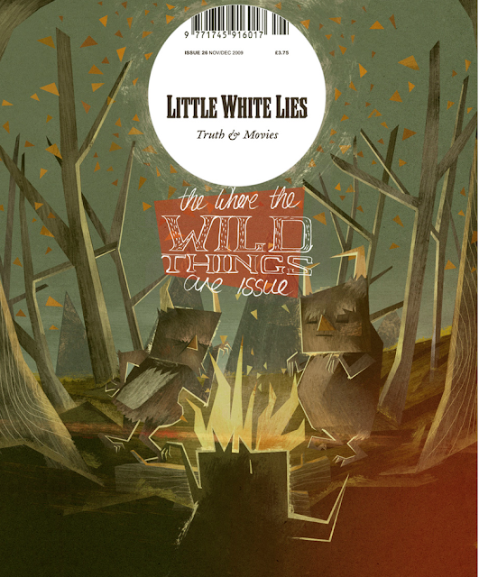
Matt Lyons, quite simply love his illustrations.

Thursday 19 January 2012

Visual communication Blog Task// 5 Examples

5 examples of visual communication that anyone can see: 

Train Ticket


Ad on Train


Billboard


Ad at Bus stop


Passport

Hotdog Book// Olympics-inspired graphic fun


http://www.creativereview.co.uk/cr-blog/2012/january/olympics-inspired-graphic-fun

Its not the content I am interested in but the booklet itself. I found this on the creative review blog. This is sometime I need to think about with my booklet. Simplicity! This book is so simple but works to well .

Thursday 12 January 2012

Lecture 8: The History of Type


Aims!
Give a simple introduction the history of typography
Introduce the six main classifications of type
Introduce some famous type faces and their related connotations
Introduce the metalinguistic function of typography
Bore everyone to death talking about kerning and x-heights

Give a simple introduction the history of typography
Introduce the six main classifications of type
Introduce some famous type faces and their related connotations
Introduce the metalinguistic function of typography
Bore everyone to death talking about kerning and x-heights


How Colour and type can effect the way we think and see. The Red on with the crown gives a sense of importance. The red connotes the Royal Family ONLY because the Crown is an iconic symbol of the queen. 


This seems to be screaming at you. The red and the rule stops indicate this, and of course the fact its in capital 


Gender, not really aimed at men?


This typeface doesn't look very rock and roll for iron maiden. 


TYPE CLASSIFICATIONS


Gutenburg Gothic Script 1450

HUMANIST TYPEFACES 

similarities in fonts. 


The Types of the eighteen century English Printer William Caslon are characterised by crisp, upright characters that recall the fluid strokes of the flexible steel pen and the pointed quill


Modern / Didone Typefaces

Attributed to Firmin Didot, 1784 but the most influential ‘Didone’ typeface was created by Giambattista Bodoni.


SANS SERIF TYPE-FACES

Akzidenz Grotesk
Berthold Type Foundry 1896


Eric GILL // 'GILL SANS' 1926 

'Gill was born in 1882 in Brighton, Sussex (now East Sussex) and in 1897 the family moved to Chichester. He studied at Chichester Technical and Art School, and in 1900 moved to London to train as an architect with the practice of W.D. Caroe, specialists in ecclesiastical architecture. Frustrated with his training, he took evening classes in stonemasonry at Westminster Technical Institute and in calligraphy at the Central School of Arts and Crafts, where Edward Johnston, creator of theLondon Underground typeface, became a strong influence...en.wikipedia.org/wiki/Eric_Gill

TIMES NEW ROMAN FONT


Stanley Morrison- 

'Stanley Morison (6 May 1889 – 11 October 1967) was an English typographer, designer and historian of printing.
Born in Wanstead, Essex, Morison spent most of his childhood and early adult years (1896 - 1912) at the family home in Fairfax Road, Harringay. He was self-taught, having left school after his father abandoned his family, Morison became an editorial assistant on The Imprint magazine in 1913. As a conscientious objector he was imprisoned during the First World War, but became design supervisor at the Pelican Press in 1918. This was followed by a similar position at the Cloister Press.
In 1922 he was a founder-member of the Fleuron Society dedicated to typographical matters (a fleuron being a typographic flower or ornament). He edited the society's journal The Fleuron from 1925 to 1930. The quality of the publication's artwork and printing was considered exceptional. From 1923 to 1925 he was a staff editor/writer for the Penrose Annual, a graphics arts journal.

From 1923 to 1967 Morison was typographic consultant for the Monotype Corporation. In the 1920s and 1930s, his work at Monotype included research and adaptation of historic typefaces, including the revival of the Baskerville and Bembo types. He pioneered the great expansion of the company's range of typefaces and hugely influenced the field of typography to the present day.
Morison was also typographical consultant to The Times newspaper from 1929 to 1960 and in 1931, after having publicly criticised the paper for the poor quality of its printing, he was commissioned by the newspaper to produce a new easy-to-read typeface for the publication. Times New Roman, the typeface Morison developed with graphic artist Victor Lardent, was first used by the newspaper in 1932 and was issued commercially by Monotype in 1933.
Morison edited the History of the Times from 1935 to 1952 and was editor of the Times Literary Supplement between 1945 and 1948. He was elected a Royal Designer for Industry in 1960 and was a member of the editorial board of Encyclopædia Britannica from 1961 until his death in 1967 in London...' Stanley Morison


1994 Rudy Vanderlans argues ‘there is a new generation of graphic designers who, before ever considering what their favourite typeface is, will design a new one’


CONCLUSION 
Different Type families to explore – Humanist / Old Style / Transitional / Modern / Slab Serif / Sans Serif
Remember that type communicates visually and is not just a vehicle for content
There is nothing more satisfying than a beautifully tight kern! 

Lecture 7: High Culture VS Low Culture


Objectives:
Understand the term avant-garde
Question the way art/design education relies on the concept
 of the avant-garde
Understand the related concept of art for arts sake
Question the notion of genius
Consider the political perspectives relating to avant-gardism
Question the validity of the concept avant-garde today


Marchal Duchamp


'Fauvers'
Wild Beasts


Visual Communications
‘The second level aim s to let you experiment within you chosen range of disciplines
 ‘Our aim is to encourage students to take a radical approach to communication’
 To be a student on the course you need to enjoy:-
Challenging conventions


Printed Textiles
& Surface Pattern Design

 Our aim is to provide an environment which allows you to discover, develop, and express your personal creative identity through your work’
 ‘Level one studies concentrate on ‘… experimentation’

Interior Design
‘We encourage students to challenge conventional thinking ’

Furniture
Throughout the course you will be encouraged to form a personal vision and direction based upon critical self –analysis

Fashion/Clothing
We encourage you to develop your individual creativity to the highest level . . .
 
Level one studies concentrate on . . . .experimentation

Art and Design (Interdisciplinary)
 
What will unite all your creative output will be the ability to apply your creative and technical skills in innovative ways, which are not limited to traditional subject boundaries

LCAD quotes prioritise certain concepts:
 (feel free to question these)

1.     Innovation [creating new stuff]

2.     Experimentation [process involved in order to achieve new
        stuff]
3.     Originality [to copy is bad, to be original is good]

4.     Creative genius [to bring out a hidden creative depth held
            deep within the student]


ITS ART FOR ART'S SAKE


End of the 19th /early 20th C
 two approaches to avant-garde art


1.     art that is socially committed [artists being the
avant-garde of   society, pushing forward political objectives]
 2.     art that seeks only to expand / progress what art is (in itself
        and for itself) / art for art
s sake  

Significant Form 
The relations and combinations of lines and colours, which when organised give the power to move someone aesthetically


Socialist Realism
Vladimirski ‘Roses for Stalin’ (1949)


Constructivism
Rodchenko ‘Books’ (1924)
  

A major problem for the avant-garde is that it seems to necessitate ELITISM

So for those members of the
left wing [interested in social change] there was a tendency to have to rely on ACADEMIC TECHNIQUES in order to appeal to the public
.

What is Kitsch?


Constable Haywain (1821)  [Not Kitsch]


Jumping across Media & Durer Praying Hands (1508)


Simplification of style – repainted masterpieces for the modern eye


Thomas Kinkade


Simplification of style – repainted masterpieces for the modern eye


Damian Hurst (2007) For the love of God


Questions to ask your Tutor

1. Why does our work have to be original?
2. Is it possible to be avant-garde and/or
      original?
3. If I make my work socially committed so
       that people can understand it can it still be
       avant-garde / innovative?