Friday 18 October 2013

COP Presentation

1)

At the beginning od the summer I Didn’t know what my question was but knew I wanted to do revolve it around album cover art and the marketing of music.

FOR EXAMPLE How the packaging and design of an album worked in selling the music. It took a while for me to get the ball rolling.

2)

I did a 2000 word case study on Storm Thorgerson and Audrey Powell, talking about what it was about their work that had such an influential and inspiring effect on the industry, what it was about these covers that made the music  sell.
I went into the history of the two and the two founding Hipnogisis in 1968.
What it was about these album covers the was so influential to both art and the music industry
I analysed in total 7 of their most famous covers, explaining the history and meaning behind them and the effects they had on the industry.
And then my conclusion

3)

Up intill very recently my question was “what role did the album cover play in influencing the purchase of records in recent decades
I felt this question didn’t quite fit what I wanted to talk about so
How has album cover design influenced the purchase of records compared to other marketing techniques in recent decades?”
 I am interested to compare how the album cover sold music against other marketing techniques that came after, such as

music television, and todays online promotion and discover whether there is still a need for the album cover.

4)


5)

Teppo Hudson’s dissertation ‘Significance of Album cover art as a branding tool.
This 60 page dissertation goes through a lot of very interesting subjects. In his abstract is explains His research is aimed to study the relationship between album cover art and branding theories.
Taking the band HIM as his main line of focus who he says have been very successful of making their cover art a branding tool.
Branding in the music industry
Construction of an identity
-Cover art having an important role of representing the music as a visual symbol.
Marketing in the music industry- There is a lot of very helpful information about marketing in the music industry.

6)

7)

For my practical I want to rebrand a band. Whether that actually be for a band or simply for a band I like.
This example above is the rebrand of Temper Trap by Boat Studios in London.
‘We wanted to create a visual identity that could run throughout an album campaign, visuals you could remove their logo from and it would still be unmistakably theirs’
So I woul produce an album cover to go across vinyl and CD.
Inner sleeve and center labeling.
Promotional matielal

And in the example here they have also made a book.

Monday 14 October 2013

Dissertation Research Methods

Primary research refers to the collection of data for the first time. This data is collected for some specific purpose. Primary research is more expensive and time consuming but it will give better results than secondary data (Gratton & Jones, 2010).There are several methods that can be used for research like interviews, questionnaire, surveys, observation etc. 

Primary Research Methods

Interviews: Interviews are the useful method; if person’s personal information is required. It can be used in both quantitative and qualitative research. Interviews can be telephonic, face to face. It can be formed in structured and unstructured manner (Pakroo, 2009).

Observation: Data in primary research can be collected through observing the people while working in an organization. Researcher can get information by sitting in the market and observe the customers. Observation is useful if consumption of total time and cost is required. 

Questionnaire: Questionnaire is a statement that contains a series of questions that will be asked from respondents. (Walliman, 2005).But sometimes respondents do not give correct information. And researcher can also do manipulations in information that is obtained. 

Focus Group: In this method five to eight members sit together and discuss the problem. All members give their views related to problem, this help in getting the required data. It is more useful in organization (Green, 2000). 

Surveys: It is the method of collecting information by sending mails of questionnaires to the respondents. It avoids the traveling cost and also consume less time.

Sampling: It is done when new product is launched in the market. Samples of the product are sold in the market to check the response of the customers. Through feedback researcher can improve the quality of product if required.

Researcher can select the methods for primary research on the basis of type of data and information required for the research. If the researcher need personal information from respondents then interview method will be more suitable. Primary research is suitable where the area of research is small. In this, questionnaire method may also be selected because it covers specific area of respondents such as customers, employees etc. Sampling method is also useful for the small area. 


Website : dissertationhelponlinE

The Importance of Album Art in the Digital Age by Hilary Robertson

Hilary Robertson (2013). Music Think Thank [online]. Available from: <http://www.musicthinktank.com/blog/the-importance-of-album-art-in-the-digital-age.html>. [Accessed 14/10/13].

http://www.musicthinktank.com/blog/the-importance-of-album-art-in-the-digital-age.html

The Importance of Album Art in the Digital Age by Hilary Robertson

As we all increasingly download our music rather than browsing through the shelves of our local record shop, album artwork is less important. Or is it?
There is evidence to suggest that musicians and audiences are still interested in imagery surrounding music.
“I like a bit of controversy. It tests the nation’s intelligence.”
When photographer and director David Boni came up with the idea of hanging The Stranglers in a kids’ swing park, bass player JJ Burnel, replied “I like a bit of controversy. It tests the nation’s intelligence.” And so, the cover of brand new album ‘Giants’ was born. Currently touring the album – and, inevitably, some of their classic tracks like ‘No More Heroes’, ‘Golden Brown’ and ‘Peaches’ – the band has seen a revival in fortunes across Europe, only tainted by drummer Jet Black’s recent illness.
Ironically, the album music and cover has tested the intelligence of more than just the UK. ‘Giants’ is The Stranglers’ 17th album, almost 35 years since the release of ‘Rattus Norvegicus’, and Europe can’t get enough of it. A successful UK tour was followed by 20 dates around Europe and huge interest from the media, with festival appearances booked through the summer.
David Boni (www.davidboni.com) explains how the shocking imagery came about for the album. “I’m a huge fan of The Stranglers and thought it was time they came up with something shocking again. After all, they’ve been known for decades for being controversial. The band was really receptive to the idea which my colleague Dave Mullen and I came up with. We knew it had to be real and within the grounds of ‘reasonably’ tasteful, but a bit naughty.”
The photo-shoot took place in a closed set at Pinewood and, although Dave isn’t giving the trick away, there’s only a little Photoshop used. “This was all about having fun and being exciting. It’s one of the best pictures I’ve ever worked on. This is the first album that’s been banned from TV before the 9pm watershed and it’s been completely banned from the London underground. It looks great on CD but even better on vinyl – that 12” format really suits great imagery.”
 A bit of history
Originally pioneered by German record company Odeon in 1909 with Tchaikovsky’s ‘The Nutcracker’ suite, the album cover became more than just a protective sleeve. By the 1950s, imagery was important in marketing the music within and a whole culture was born, with its own industry and support acts, with photographers, artists and cartoonists all making their mark alongside bands.
The cover became an important part of the culture of music through the 1960s and 1970s, with some album covers becoming collectable in their own right, especially from bands like Pink Floyd, Queen and The Rolling Stones. The 1967 release of The Beatles’ Sgt. Pepper’s Lonely Hearts Club Band broke new ground with cut-out inserts, lyrics and a gatefold sleeve even though it was a single album. So iconic has the album become that original pop artist Sir Peter Blake has recreated it, with modern imagery, to celebrate his 80th birthday this year. Criticized again for those he’s included and those he’s omitted, Blake has produced another classic, albeit outside of the album format.
                                      
What’s New
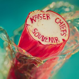
Kaiser Chiefs are releasing an album of singles in June and they approached photorealist painter Sarah Graham (www.sarahgraham.info) for the cover.
“I’ve known the band for a while,” says Sarah, whose art already graces the homes of the rich and famous around the world. “They’ve been interested in using my art for about four years and this was finally our chance to work together.”
The seaside rock imagery is typically British. Anyone who’s holidayed on the coast in the UK will have seen the sweets on sale, usually with writing or a pattern running through the middle. For the album, Kaiser Chiefs commissioned Blackpool rock maker Heather Boyce to produce unique sticks of rock that were then photographed and painted by Sarah. She says: “The idea came together really quickly in the end and the painting took just nine days. It’s such an instant visual and I love it. The band used video from the making of the rock for their single ‘On The Run’ and there’s a slide show of me painting the album cover which should be on the Kaiser Chiefs’ website soon.”

The role that packaging plays is evolving, with more bands releasing their albums on vinyl as well as CD and online downloads. Most of us like our music to be tangible – something you can hold and cherish – as well as audible and beautiful or controversial artwork should remain a part of that. There’s nothing quite like holding an album cover, with an image on one side and information on the other. For the moment, it doesn’t look as if the digital age is killing that.
COMMENTS:
"...I've been designing artworks for CDs and digital downloads for the last 11 years. If one doesn't buy a CD with an interesting, meaningful and content-matching artwork, at least pays attention to it. It was great for the CDs in local stores. These days, in terms of art for digital downloads it's still about illustrating music or ideas behind an album and these artworks are even more used on-line (stores, profiles, banners, badges etc). So all in all but this profession won't die since a good looking artwork is like a product packaging, though must match an album content to me."
"...In addition to being a recording artist and, particularly, as a result of also being a retired (20 years) international radio/video promoter and media publicist, I am an extremely strong supporter of proactively engaging cover art for music. As I grew up in the "album" era when album covers were works of art unto themselves, ever piquing the listener to take a listen to the "inside," and with the reduction in size of physical music covers, cover art is even more important today in many instances through its ability to first attract listeners visually. Similarly to The Stranglers' cover art, my "cAsE sEnSiTiVe" CD cover presents me tied around my shoulders and ankles with rope with a ticking bomb at my feet. I also address this very subject of cover art importance via one of my instructional videos on my YouTube channel."
I'm a strong believer in album art as a summation or extension of an album's concept or themes. I wrote more about this and the future direction of album art at http://www.independentmusicawards.com/ima/artist/Elizabeth-Maplesden


Is Album Artwork Dead// Online Article

Is Album Artwork Dead? 
Music Radar [online]. (2013). Available from: <http://www.musicradar.com/news/tech/is-music-artwork-dead-574302>. [Accessed 14/10/13].
With the recent problems faced by HMV, the UK's last remaining high-street music retailer, a lot of us have been reflecting on how the way we purchase our singles and albums has changed.
Whereas once it was all about browsing through racks of vinyl/CDs (delete as applicable), these days, the majority of us either order physical copies of music releases via the internet or, increasingly, simply buy them to download as MP3s.
The most significant ramifications of this change have been well-documented - a loss of revenue for the music industry thanks to piracy and the closing of record shops being the two most notable - but the shift to a culture of downloading has influenced not only how we purchase our music, but also, perhaps, which music we actually buy. The death of the album has long been predicted, for example - who needs filler when you can now download just the killer tracks individually? - but there's also the question of whether music artwork is still relevant.

A different picture

Now, some might argue that the golden age of the album cover has long gone anyway (if you've never waxed lyrical about a gatefold sleeve, then you probably missed it), but as long as there were a significant number of shops selling CDs, it still had some kind of influence.
These days, however, you're far more likely to seek out an album or track to download based on a recommendation or having heard it already, so does its accompanying artwork really have any relevance?
Jay Aquasion of US drum 'n' bass labels Textures Music Group and Soul Deep Recordings has mixed feelings on the matter. "I don't think album or single artwork is as important as it once was with regards to the digital music culture today," he says.
"Although, having artwork for a physical release of an album or single is a different animal, and I do agree with using artwork in these situations. All physical product you will see from Textures Music Group and Soul Deep Recordings will have artwork for this reason.
"The philosophy behind using the Textures Music Group logo as the cover art for the digital releases is that, with artwork, it's hard to distinguish which label the release is from at the glance of an eye. Most people don't read the small text where the label's name is written on the leading download sites in the digital market.
"With Soul Deep Recordings, we initially did the same to create recognition with the brand, using no artwork. It worked well, but then the label switched to using artwork, and it's been unbelievably well received. If the shoe fits, wear it.

Keep it simple

A more committed advocate of music artwork is Brazil-based LuvDisaster Records' Oliver Ferrer. "The cover was always important on physical products, but in the digital market it is still important - it should just be more simple. Most digital stores use only thumbnails of the covers, so the art for the digital market should be based on this. It's no good having beautiful artwork that works well in a large size if the sites only use it small."
Think little, then, is the takeaway message, but how important is it that, even if they don't generate unique artwork for every individual release, artists have some kind of visual identity? A logo or photo that they can use across all releases and social media channels, for example?
"The look is very important," says Oliver Ferrer. He believes that some kind of 'branding' is "an important supplement that reinforces the message of the artist […] and complements their work".
Jay Aquasion takes a similar view: "I strongly feel it's important that artists still have some kind of identity. Too many artists are attention whores and don't have a personality behind their music that people can buy into. This is another big reason why many new artists fail early on.
"As for using their logo on label artwork, I'm personally against it unless it's on a physical release as I mentioned earlier. Artists using their logo on social media channels, however, is an excellent idea, and I highly recommend focusing on building whatever brand or logo you have."
Having some kind of consistent visual message is probably still important, then, but could the fact that we're no longer judging books by their covers - or, more specifically, musicians by their artwork - actually be a good thing?
A lot of up-and-coming artists complain that being a successful musician is more about marketing than it is tunes, but is it now easier for the music to speak for itself and succeed or fail on its own merits, or does the demise of album artwork mean that there's a danger that artists will become more anonymous?
"I don't think it's necessarily a good thing or a bad thing, but the digital market has changed the way we invest in the process of releasing music," says Jay Aquasion. "Back when artwork was part of the norm, labels invested in physical merchandise that couldn't digitally be copied and transmitted around the world. But if it doesn't make dollars, it doesn't make sense.
"I agree that it means that music has to speak for itself. If you look at many of the artists that debuted on Textures Music Group, the ones that had a good support system behind them, or the ones that stuck with us, all went on to do big things. [A lack of artwork] only makes an artist anonymous if the music is lame, there's a lack of commitment or consistency on the artist's part or the artist doesn't have a good support system behind them."
As a keen evangelist of artwork, it's no surprise that Oliver Ferrer still considers it to be extremely important: "It is very dangerous to think that the music alone will do the sales job - getting fans goes far beyond that. I think that only a complete work will truly captivate your customers."

Blank canvas

It seems likely that artwork will still have a role to play as the music business re-shapes itself, but it's debatable whether or not artists and record companies will continue to invest heavily in it.
For those individual artists who want to create their own visual identity, Jay Aquasion has some final words of wisdom: "The best advice I can give to anyone wanting to use artwork is to find someone who is a qualified graphic designer and arrange for them to design all of your artwork so that you maintain consistency with the designs."

Saturday 5 October 2013

Peter Saville's 'Unexpected Pleasures' 1979


My Research is slowly bringing me towards the 1980s and this cover for Joy Division is a great example of a very iconic album cover.


"In the history of album art, few designs are more famous than the minimal image of white waves against a black background that adorns the cover of Joy Division’s Unknown Pleasures. When even Mickey Mouse is lifting the image, you know it’s thoroughly penetrated the mainstream. But while everyone seems to have a vague idea of what designer Peter Saville’s art represents, it’s a rare treat to hear the designer himself tell the story behind it.
So we’re excited to see that Visualized has posted a new video interview in which Saville discusses the Unknown Pleasures cover. He tells the story of Joy Division bringing him the graph, which he describes as “a comparative path demonstration of the frequency a signal from a pulsar. And, in fact, it’s the first pulsar ever observed,” taken from the pages of an old textbook. As many have pointed out, pulsars are “a stage in the formation of a black hole.” Saville also talks about the cover’s influence over the years. “It’s kind of a template which people continue to interpret in a deeply serious, melodramatic, or quite comic way,” he says. “It’s the endless possible interpretations of this diagram that make it so powerful, and in a way useful, for something like an album cover.” Watch the video below."
It’s kind of a template which people continue to interpret in a deeply serious, melodramatic, or quite comic way,” - Peter Saville
“It’s the endless possible interpretations of this diagram that make it so powerful, and in a way useful, for something like an album cover.” - Peter Saville

Wednesday 2 October 2013

Documentury Research// Under The Covers

UNDER THE COVERS by BILL DAY & TERRY SCHWARTZ 
PART 1/10

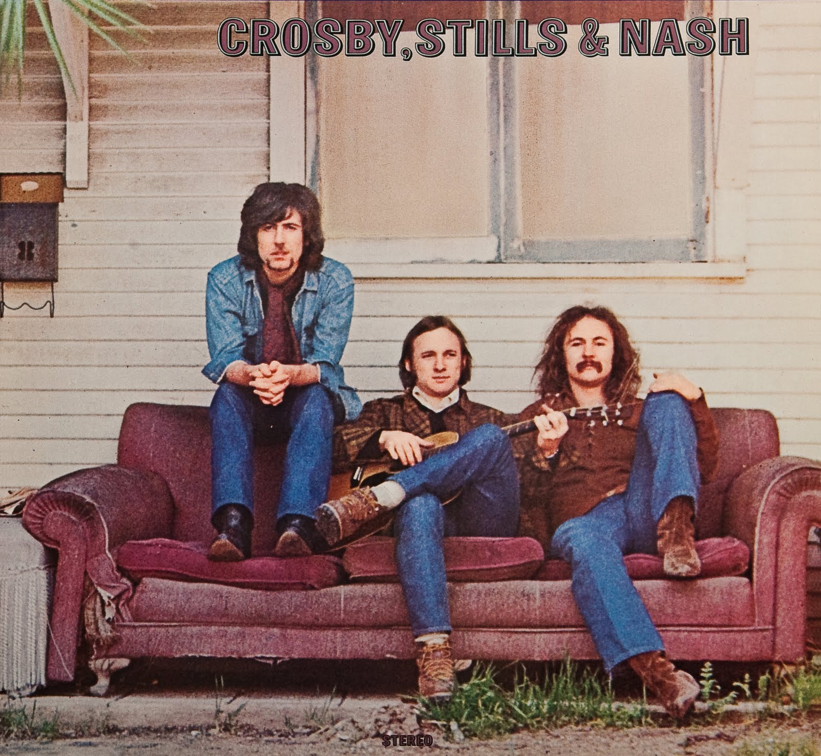
Gary Burden (Graphic Design) & Henry Diltz (Photography) Crosby Stills & Nash

When taking the photos for this cover the band didn't yet know their name, so wasnt in the correct order in the photo. The order of the photo goes Nash, Stills & Crosby.
This was very confusing as fans thought Crosby was Nash and Nash was Crosby.

They agreed to go back and take the picture but to their horror the building had been demolished.
The album had to have all the major things on it- The Logo, The Title & 'Stereo"

Gary made these three things very small as to not interfere with the Henry's photography.

"The bottom line for the record company was they didn't spend money on album packaging, that was something they wouldn't even discuss. They put it in the cheapest possible packaging. Their philosophy was if you had a hit record you could put it in a brown paper bag and sent it out, so, here I was asking to spend three times as much money to make a package, and, you know, they were absolutely not going to do it. And fortunately I was able to resist their resistance by using the power of the band to say you will spend the money" - Gary Burden

The company gave in and agreed to spend more money on album packaging. CS&N was relseased in June of 1969 and by March of 1970 had sold more than 2 million copies.

The company from that point onwards always spent more money on album packaging.

...................................................................................................................................................................

"Album covers for me, they were bigger than they are now and they were like a shield. Indians would dream up a dream or imagine or think of their thing that represented them" Jackson Browne 


'Saturate Before Using' was one of the 100 greatest album covers of all time" Entertainment Weekly Magazine.

...................................................................................................................................................................

Joni Mitchell- Blue


"I'm very proud of that album cover I think it's one of the best album covers I've made and I think its the only Joni Mitchell album cover that isn't her art work"

"What I tried to do was make something really simple and classy, rather than just use a black and white photo on an album that was called blue, i new there was such a thing as phenotypes and so I took a black and white photo and turned it into a blue package" Gary Burden
...................................................................................................................................................................

The Eagles- Desperado 


Gary Burden wanted to relate the rock guitarist of the 1970s to the gun slingers of the 1870s 

'What it is is these 4 guys that come to ton and they have decided to stop working and to take the easy way and become outlaws, so they go in and rob the bank, in when coming out of the bank they get killed' Gary Burden 

The set and the photographs actually looked like the 1870s. 

It's been a record and a concept thats stood the test of time and has gotten better as the years have gone on. As a whole piece, you know, its a well recognised concept. But at the time there were some people who weren't too happy. All they could think of was (gasp) "they made a god dam cowbody record! Where's Witchy Woman, wheres Take It Easy for christ sake! They made a fucking cowboy record!" Glenn Frey
...................................................................................................................................................................

I would say probably the biggest impact that we've had on the record industry and graphics would be creating imagery that helps to tell the story of what the music is about, and doing it in a way where we really take care and attention to the detail so that when the audience gets something and holds it in their hand and looks at it, it's something beautiful and something meaningful. In the days of these album covers there was no MTV so people would look at these 
images while listening to the record and it would tell them the story and would be exactly what they wanted to know about this band, about these artists, who they were, what people they were, what were they thinking, what does the song mean, where does it come from. They would sit for hours and try and read into this...now its a whole other world, its a little square, quarter the size of an album cover. So everything keeps changing and we keep moving with it. We changed that record shape to what it was in the 40s and 50s and we would make it work for us and now were confined to this little shape right here" Gary Burden