
Aims!
•Give a simple introduction the history of
typography
•Introduce the six main classifications of
type
•Introduce some famous type faces and
their related connotations
•Introduce the metalinguistic function of typography
•Bore everyone to death talking about
kerning and x-heights
•Give
a simple introduction the history of typography
•Introduce
the six main classifications of type
•Introduce
some famous type faces and their related connotations
•Introduce
the metalinguistic
function of typography
•Bore
everyone to death talking about kerning and x-heights


How Colour and type can effect the way we think and see. The Red on with the crown gives a sense of importance. The red connotes the Royal Family ONLY because the Crown is an iconic symbol of the queen.


This seems to be screaming at you. The red and the rule stops indicate this, and of course the fact its in capital

Gender, not really aimed at men?

This typeface doesn't look very rock and roll for iron maiden.

TYPE CLASSIFICATIONS


Gutenburg Gothic Script 1450
HUMANIST TYPEFACES


similarities in fonts.


The Types of the eighteen century English Printer William Caslon are characterised by crisp, upright characters that recall the fluid strokes of the flexible steel pen and the pointed quill


Modern / Didone Typefaces

Attributed to Firmin Didot, 1784 but the most influential ‘Didone’ typeface was created by Giambattista Bodoni.


SANS SERIF TYPE-FACES
Akzidenz Grotesk

Berthold Type Foundry 1896

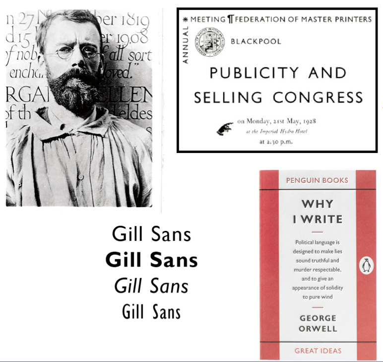
Eric GILL // 'GILL SANS' 1926
'Gill was born in 1882 in Brighton, Sussex (now East Sussex) and in 1897 the family moved to Chichester. He studied at Chichester Technical and Art School, and in 1900 moved to London to train as an architect with the practice of W.D. Caroe, specialists in ecclesiastical architecture. Frustrated with his training, he took evening classes in stonemasonry at Westminster Technical Institute and in calligraphy at the Central School of Arts and Crafts, where Edward Johnston, creator of theLondon Underground typeface, became a strong influence...' en.wikipedia.org/wiki/Eric_Gill
TIMES NEW ROMAN FONT


Stanley Morrison-
'Stanley Morison (6 May 1889 – 11 October 1967) was an English typographer, designer and historian of printing.
Born in Wanstead, Essex, Morison spent most of his childhood and early adult years (1896 - 1912) at the family home in Fairfax Road, Harringay. He was self-taught, having left school after his father abandoned his family, Morison became an editorial assistant on The Imprint magazine in 1913. As a conscientious objector he was imprisoned during the First World War, but became design supervisor at the Pelican Press in 1918. This was followed by a similar position at the Cloister Press.
In 1922 he was a founder-member of the Fleuron Society dedicated to typographical matters (a fleuron being a typographic flower or ornament). He edited the society's journal The Fleuron from 1925 to 1930. The quality of the publication's artwork and printing was considered exceptional. From 1923 to 1925 he was a staff editor/writer for the Penrose Annual, a graphics arts journal.
From 1923 to 1967 Morison was typographic consultant for the Monotype Corporation. In the 1920s and 1930s, his work at Monotype included research and adaptation of historic typefaces, including the revival of the Baskerville and Bembo types. He pioneered the great expansion of the company's range of typefaces and hugely influenced the field of typography to the present day.
Morison was also typographical consultant to The Times newspaper from 1929 to 1960 and in 1931, after having publicly criticised the paper for the poor quality of its printing, he was commissioned by the newspaper to produce a new easy-to-read typeface for the publication. Times New Roman, the typeface Morison developed with graphic artist Victor Lardent, was first used by the newspaper in 1932 and was issued commercially by Monotype in 1933.
Morison edited the History of the Times from 1935 to 1952 and was editor of the Times Literary Supplement between 1945 and 1948. He was elected a Royal Designer for Industry in 1960 and was a member of the editorial board of Encyclopædia Britannica from 1961 until his death in 1967 in London...' Stanley Morison


1994 Rudy Vanderlans argues ‘there is a new generation of
graphic designers who, before ever considering what their favourite
typeface is, will design a new one’


CONCLUSION
•Different
Type families to explore – Humanist / Old Style / Transitional / Modern / Slab
Serif / Sans Serif
•Remember
that type communicates visually and is not just a vehicle for content
•There
is nothing more satisfying than a beautifully tight kern!